I have no idea how to create pages but I'll figure it out eventually godammit

Showing posts with label Ultra. Show all posts

Monday, January 15, 2024

BIRTHDAY BOOLSHEET BLASTER: PART 12 - THE SECOND PILE OF RANDOM CRAPOLA

 WE HAVE REACHED THE SECOND ROW OF THE BOX WHICH MEANS MORE RANDOM CRAPOLA. TODAY'S CRAPOLA IS SPLIT INTO TWO DIFFERENT DISTINCT SECTIONS: PART 1) THE TRADITIONAL RANDOM NONSENSE. PART 2) SOMEBODY RIPPED SOME PACKS AND DUMPED THEM INTO THE BOX. LET'S BEGIN AT THE BEGINNING


LONG BEFORE PANINI WAS FORCED AT GUNPOINT TO PIVOT TO PROSPECTS, DONRUSS TURNED THE ELITE BRAND INTO A FOILY MINOR LEAGUE SET. I WILL ADMIT TO BUYING A COUPLE PACKS HERE AND THERE AND EVEN PULLED A DUSTIN PEDROIA AUTOGRAPH ONCE. OTHER THAN THAT I COULDN'T TELL YOU ANYTHING ABOUT THE CARDS. RYAN TATUSKO HERE TOPPED OUT AT TRIPLE-A HERE BUT ALSO PLAYED IN THE KBO AND VENEZUELAN, PUERTO RICAN AND DOMINICAN WINTER LEAGUES


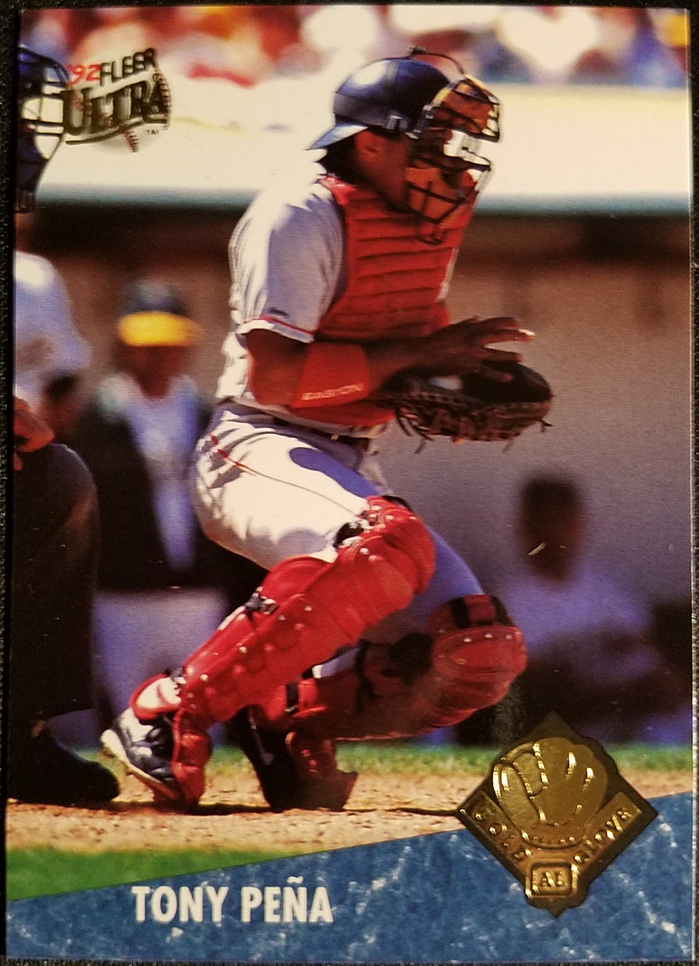
NEW PINNACLE. DID ANYONE EVER COLLECT THIS? I REMEMBER SEEING IT IN 2013 AND IMMEDIATELY THINKING LOL NOPE BUT WAS THAT EVERYONE'S REACTION? THERE WERE SOME PRETTY AWESOME INSERT CARDS IN THERE BUT I FOR ONE HAD NOT ACCEPTED THE FACT THAT BASE CARDS WERE WORTHLESS AS FAR AS THE INDUSTRY WAS CONCERNED YET. IT'S NOT EVEN A BAD DESIGN, JUST A LITTLE OFF WHEN YOU COMPARE IT TO THE ORIGINAL BLACK BORDER PINNACLE SETS. IT DEFINITELY COMPARES FAVORABLY TO THE CHONICLES PINNACLE SETS. ANYWAY, HERE'S DAN HAREN  


DIAMOND KINGS ARE ALWAYS WELCOME. I'M A BIG FAN OF THE 1987 DONRUSS SET AND BOUGHT A WHOLE HOBBY BOX OF IT WHEN IT CAME OUT. TWENTY-FIVE WHOLE DOLLARS! THAT'S HOW MUCH I PAID FOR ALL THIS CRAP! SINCE I COMPLETED THE SET A COUPLE DECADES AGO I'VE KIND OF IGNORED IT, PERHAPS I SHOULD BUILD A SECOND SET OR AT LEAST LOOK INTO THE VARIATIONS. OH WAIT, THE WHOLE SET IS A VARIATION. THANKS FACTORY SET SHENANIGANS


WOOOO! MORE SPORTS ILLUSTRATED FOR KIDS CARDS. THIS ONE WAS TORN SORT OF COCKEYED AND THERE'S A BIG FLAP ON THE BACK THAT REFUSES TO STAY DOWN. I'M ACCUMULATING A NICE LITTLE PILE OF THESE CARDS SOMEHOW


VINTAGE IN THE TRASH BOX, HELL YEAH. RICHIE ZISK WAS ONE OF THE FIRST 70S CARDS I EVER GOT, I THINK IT WAS THE 1977 VERSION. HE WAS A PRETTY GOOD PLAYER TOO! A GOOD START ON THE 70S FOR LITTLE ME


RANDOM 2022 OPTIC CARD OUTTA NOWHERE OF ANOTHER Z-NAMED PLAYER. THIS WILL EVENTUALLY GO INTO THE "NEW" BOX OF STUFF I DON'T KNOW WHAT TO DO WITH


HOORAY! AN ALLEN & GINTER CARD! I STILL HAVE BARELY ANY OF THE 2022 VERSION AND NONE FROM 2023. I HAVE NO IDEA WHAT THE RHYME OR REASON WAS FOR THROWING THESE CARDS IN THE FRONT OF THE BOX. THE REST ARE ALL ABANDONED PACKS. THIS I'VE SEEN PLENTY OF TIMES ESPECIALLY WITH BORED SELLERS OPENING UP ALL THEIR PROFIT


STARTING OFF WITH TWENTY FOUR 1994 UPPER DECK CARDS. THERE ARE THREE ELECTRIC DIAMOND CARDS SO I GUESS THAT COULD BE THREE EIGHT CARD PACKS WORTH. MY WANTLIST FOR THIS SET IS IN SINGLE DIGITS AND MOST OF THEM ARE STARS SO THERE WERE NONE I NEEDED


THIS ALAN TRAMMELL CARD IS STILL WORTH SHOWING OFF. YER OUT! RANDOM DUDE. I CAN'T TELL WHAT TEAM THE RUNNER IS FROM, I THOUGHT MAYBE ROYALS BUT THE UNI HAS YELLOW TRIM. BREWERS PERHAPS?


NEXT IS TWO-ISH PACKS OF 1994 COLLECTOR'S CHOICE. THERE ARE TWO SILVER SIGNATURES AND ONE SCRATCH OFF INSERT. I DO NOT HAVE A WANTLIST OF THIS AND PROBABLY NEVER WILL. IT'S FUN TO LOOK THROUGH THOUGH, THERE'S A COUPLE HOWARD JOHNSONS, A HAROLD REYNOLDS AND AN UP CLOSE AND PERSONAL WITH JUAN GONZALEZ IN HERE


UPPER DECK TRIED THE SCRATCH-OFF GAME GIMMICK THAT TOPPS USED IN 1970 AND 71 AND ADDED THE EXTRA COMPLICATION OF DEFENSIVE CHECKS. THESE ARE WEIRDLY DIFFICULT TO FIND NOWADAYS AND THERE PROBABLY AREN'T MANY BETTER PLAYER COMBOS THAN THE DODGER-GIANT RIVALRY OF PIAZZA AND BONDS


OH NOEZ! I'VE BEEN BIPPED!


THESE ARE NO SO MUCH RIPPED PACKS AS MINI TEAM LOTS OF THE ANGELS AND PHILLIES. I FOUND A CARD I NEEDED, RENE GONZALES, BUT THE TRUE STAR OF 1993 LEAF IS THE BACKS


I'M NOT SURE WHO WINS THIS MATCHUP, PHILLY'S LIBERTY BELL OR ANAHEIM'S SETTING SUN. YELL OUT THE RIGHT ANSWER IN THE COMMENTS


 NEXT IS NINE CARDS FROM 1993 STUDIO SO IF THIS WAS AN ACTUAL RIPPED PACK THREE CARDS WERE YOINKED. THE SET LOOKS FANTASTIC WITH A PORTRAIT IN FRONT OF A TEAM UNIFORM LOGO PLUS A HOLOFOIL FACSIMILE AUTOGRAPH. EASILY ONE OF THE BEST STUDIO SETS EVER MADE. THIS IS ANOTHER SET WHERE MY WANTLIST IS DOWN TO SINGLE DIGITS SO NO NEEDS IN THIS PILE


STADIUM CLUB IS ANOTHER SET THAT WILL LIKELY NEVER GET A WANTLIST. THEY'RE PRETTY BUT I DUNNO MAN, MAYBE I'D HAVE MORE NOSTALGIA FOR THEM IF THEY DIDN'T COST FIVE BUCKS A PACK IN 1991. THIS PACK INCLUDES THE HOLOFOIL PARALLEL AND INFO CARD BUT ONE CARD IS MISSING FROM A FULL PACK. HIGHLIGHTS ARE THE TURK CARD HERE, A JAY BUHNER CARD AND MARK MCLEMORE PARALLEL


EIGHT 1994 SCORE CARDS ARE UP NEXT AND I DID PRETTY WELL WITH THESE. DOC IS THE STANDOUT BUT THERE'S THREE CARDS IN HERE I NEED FOR THE SET:


CHRIS GOMEZ AND VINNY CASTILLA 1993 ROOKIE CARDS AND A NICE HORIZONTAL SHOT OF RUBEN AMARO JR. THIS IS WHAT I WANT TO SEE FROM TRASH BOXES! MORE SET NEEDS PLEASE!


I JUST FINISHED THIS SET LOL


HERE'S A COUPLE PACKS WORTH OF 1990 BOWMAN COMPLETE WITH ART SWEEPSTAKES CARDS. I HAVE SO MUCH OF THIS CRAP ACCUMULATED FROM PREVIOUS LOTS I'VE PICKED UP THAT I'M MAYBE A COUPLE DOZEN CARDS AWAY FROM NOT ONE BUT TWO COMPLETE SETS OF THE STUFF YET I STILL HAVE NOT TAKEN THE TIME TO PUT TOGETHER A LIST TO TRY TO FINISH THEM. WHAT EVEN IS THE BIG ROOKIE IN THESE THINGS? SURELY PEOPLE WEREN'T RIPPING CASES OF THIS STUFF FOR FRANK THOMAS AND SAMMY SOSA, RIGHT? THAT IS A VERY NICE LARKIN HOWEVER


WHAAAAH! MOAR BIPS!


THE STRANGEST INCLUSION IN THE FILLER CRAPOLA WAS THESE RANDOM 2022 HERITAGE HIGH NUMBER CARDS. AT FIRST I WAS LIKE, HEY NICE A PACK'S WORTH OF HERITAGE, BUT NO. AS YOU CAN SEE NOT EVEN TOPPS IS THIS LOUSY WITH THEIR COLLATION

UP NEXT! A GIGANTIC PILE OF FIFTY CENT CARDS. EVEN BIGGER THAN THE LAST TEAM LOT I POSTED. UGH I'M GOING TO HAVE TO TAKE SO MANY PICTURES AND WRITE SO MANY WORDS

Monday, December 4, 2023

BIRTHDAY BOOLSHEET BLASTER: PART 9 - 50 CENT REJECTS N-O-P

THE CARD SHOW WAS INSANELY SUCCESSFUL, I GOT SO MUCH COOL SHIT FOR CHEAPS AS HELL. BUT I HAVE A HUNDRED PICS TO TAKE AND CROP AND UPLOAD AND THEN I ACTUALLY HAVE TO TYPE WORDS AND THAT WILL TAKE FOREVER SO YOU GET SOME JUNK BOX GARBAGE TODAY. BUT YOU'RE IN LUCK! IT'S SHINY JUNK BOX GARBAGE. HERE ARE THE N, O, AND P NAME CARDS THAT GOT NOPED OUT OF THE FIFTY CENT BOX

GRAIG NETTLES


POOR GRAIG GOT SCREWED. HE'S ONE OF THE BEST THIRD BASEMAN OF ALL TIME BUT ONLY ONE THIRD BASEMAN IS ALLOWED IN THE HALL OF FAME PER DECADE. TWO TOPS AND HE WAS THE THIRD BEST. THERE WERE A BUNCH OF GRAIG CARDS GETTING THE CHOP AND THIS ONE FROM 2000 YANKEES LEGENDS SET IS THE SHINIEST


THERE WERE SOME EXTRA LEGENDS CARDS OF NETTLES IN THERE INCLUDING 2003 ARCHIVES FAN FAVORITES AND 1993 TED WILLIAMS, TWO SETS I JUT COMPLETED. AWW YEAH, THAT'S FORESHADOWING BABY. YOU'LL HEAR ABOUT THAT IN MAYBE SIX MONTHS. 2006 FLEER GREATS OF THE GAME I DON'T HAVE AS MUCH. I THINK SOMEONE LEFT A COMMENT OFFERING SOME IN TRADE BUT MY LIFE IS COMPLETE CHAOS AT THE MOMENT AND I BARELY HAVE TIME TO TYPE, TRADES ARE WAY ON THE BACK BURNER, SORRY

PAUL O'NEILL 


MOAR 1965 PRISTINE! I'M HOPING TO ACCUMULATE A BINDER PAGE FULL OF THESE


THERE WAS AN ODD MIX FOR PAUL, AS I ALSO GOT A COUPLE STADIUM CLUB AND SWEET SPOT CLASSIC CARDS OF THE DUDE. I'M NOT CERTAIN IF THESE WERE FROM THE O'S OR THE YANKEES SECTION OF THE FIFTY CENT BOXES

JOHN OLERUD


METAL UNIVERSE CARD BACKGROUNDS DO NOT ALWAYS MAKE SENSE BUT THEY USUALLY LOOK REALLY COOL. THAT IS DEFINITELY THE CASE WITH THIS CARD AS OLERUD IS BEING SURROUNDED BY LIGHTNING SWIRLS. IT IS UNCLEAR IF JOHN IS BEING ATTACKED BY AN ELECTRIC TORNADO OR IF HIS MIGHTY SWING IS CAUSING A LOT OF STATIC ELECTRICITY ON HIS POLYESTER UNIFORM


THERE'S ALSO A BIG PILE OF JUNK WAX ROOKIES, WHICH ARE ALMOST WORTH AS MUCH AS THE PENNY SLEEVES THEY ARE IN. IF YOU'RE WONDERING IF OLERUD IS ONE OF THE LARGEST PLAYER PILES IN THE BOX THE ANSWER IS NO, NOT EVEN CLOSE. JUST WAIT UNTIL WE GET TO THE LETTER H

BOB OJEDA


THIS BOB OJEDA 2002 ARCHIVES CARD MIGHT HAVE BEEN IN THE FIFTY CENT BOX SINCE 2002. IT WAS IN ONE OF THE SLEEVES THAT IS STARTING TO CRUMBLE TO BITS. I ONLY NEED FOUR CARDS TO COMPLETE THIS SET AND SADLY BOB IS NOT ONE OF THEM

ROY OSWALT


YAY! ROY ADDS TO MY EVER INCREASING SUPER THICK HIGH-END CARD COLLECTION PICKED UP FOR PENNIES. ROY WAS SO GOOD THEN FELL OFF A CLIFF. I'VE GOT A LITTLE OSWALT COLLECTION HIDING IN A STAR BOX SOMEWHERE, HE WAS ON A TON OF INSERTS IN THE 00S

TONY PENA


THERE SHOULD BE A LITTLE ROOM OFF IN A CORNER AT THE HALL OF FAME DEDICATED TO CATCHERS WHO WERE ABLE TO BE AN EFFECTIVE STARTER FOR OVER A DECADE. TONY SHOULD HAVE HIS OWN DISPLAY IN THAT ROOM. THIS IS ALSO ONE OF THE VERY FEW OF THESE FIFTY CENT CARDS THAT FILL A NEED OFF A WANTLIST

ALEJANDRO PENA


THERE ARE INFURIATINGLY NO BRAVES IN THE 2004 TIMELESS TEAMS SET BUT ALEJANDRO IS A BRAVES LEGEND SO I'M CLAIMING HIM. SORRY DODGER FANS, HE WON A WORLD SERIES WITH US. I KNOW HE WON TWO WITH YOU, JUST SHUT UP AND LET ME HAVE THIS

DAVID PRICE


MAN DAVID PRICE REALLY IS A WASHED UP FIFTY CENT BOX REJECT ISN'T HE. MAN I'M SO OLD. HE'S GOT A CY AND A RING THOUGH, YOU CAN KICK HIM OUT OF THE STAR BOX BUT YOU CAN'T TAKE THAT AWAY FROM HIM. I DONT' CARE WHAT THE LABEL SAYS, THE NEWFANGLED GOLD LABEL CARDS ARE NOT GOLD LABEL WORTHY. THEY NEED TO BE PLASTIC AND EXTRA SHINY AND THICK AS A PACK OF CHROME. THE CORNERS OF THESE THINGS CAN ACTUALLY GET DINGED! UNACCEPTABLE

HUNTER PENCE


AWW YEAH THIS IS THE GOOD STUFF. I HAVE AN UNNECESSARY GRUDGE TOWARDS LINEAGE BUT DAMN DID THEY GET THEIR INSERTS RIGHT. THIS 1964 STAND-UPS DESIGN HAS BEEN SWIPED FOR MANY INSERT SETS BUT 2011 LINEAGE IS THE ONLY ONE THAT DID IT ABSOLUTELY RIGHT. THE ONLY WAY IT COULD BE BETTER IS IF THE CARD STOCK WASN'T GLOSSY

Tuesday, July 29, 2008

The Lost Box of Total Awesomeness - Ultrariffic

Dang, it's been a while since I brought the awesome. I haven't even gotten to the really super duper fantastic awesome yet. I'm sure not going to get there today, instead I have some Fleer Ultra in store for you. Ultra's kind of awesome, right? Well, not the weak 1991 set with the silver borders. The only awesome there was the logo stickers. 1992 Ultra was hella awesome though. You know it's true. After getting spanked by 1991 Stadium club, Fleer shot back with their own full-bleed bordered cards with some marble accents and just a touch of foil stamping. I am not ashamed to admit that when I first saw '92 Ultra I completely flipped over it and completelty forgot about Stadium Club. '92 started an extremely consistent 16 year run of solid photography and minimalist design on full-bleed fronts. Too bad Upper Deck bumped off the brand in order to crap out something called Upper Deck X. At any rate, there were a few Ultra cards in my box and I'll share a few of the more awesomer ones here.

27 1992 Fleer Ultra Cards

The 1992 set really set a standard that all subsequent Ultra sets had to live up to. Every card had an action photo on the front that was only augmented by the Ultra logo on one of the top corners and the player and team names in a small colored bar atop a marblized background on the bottom. These cards were head and shoulders above the '92 Leaf, Stadium Club and Upper Deck sets. ('92 pinnacle were fantastic in their own right, but in a different way) Check out this picture of Nolan Ryan and tell me that's not one of the sweetest cards of the year.

Not every photo could be as cool as Nolan's. This card of Ray Sanchez has him fielding a grounder, possibly off a fungo. It's a unique pose at least. Note the 'rookie' banner hanging off the Ultra logo like it's a field day medal or something. They only used this for two years which is a shame. I thought it could be as big as the Rated Rookie logo or Topps' Rookie Cup. Who wouldn't want a gold foil rookie banner on their first card?

Here's Deion Sanders doing what he did best in baseball. Slapping a bunt and running like hell. I wish he would have stuck around Atlanta longer. The Falcons that is, Deion could have been a good baseball player if he stuck to it full time, but the man was a Hall of Fame cornerback.

The backs were definitly not as elegant as the front, but they had their charms. The marble motif continues, as dons the colores stripes with the name and stats. There's a weird futuristic grig thing in the background behind a portrait and another action photo of the player. Three photos on one card! Holy crap! True to form, Albert Belle is about to wipe the smile off Chief Wahoo's face on this card.

Usually Fleer used the best photo on the front. This left some interesting choices for the back. On this not-quite-a-rookie card of Jeff Bagwell, they apparently couldn't get a portrait of Jeff, so they got the banjo kid from Deliverance to fill in.

Of course a lack of decent photographs sometime meant cardboard gold. Here Delino DeShields is horrified by the tiny version of himself about to hop up on his shoulder.

6 1993 Fleer Ultra Cards

There are only 6 '93 Ultra cards in the box, but that's ok because they were nearly carbon copies of the '92 set. The main difference on the front were a flamind baseball behind the Ultra logo, a different color marble and the player and team names are also marbleized. A bad trend of pringing the names in gold foil was introduced however, this innovation wouldn't die easily. Here's Marlins expansion draft flop Nigel Wilson.

The main difference on the back is the futuristic grid is now replaced with a pretty blah looking drawing of a baseball field. No one looks at the backs of cards anyway.

25 1994 Fleer Ultra Cards

This set has aged pretty well, but I hated it when it first came out. The packs were expensive, and Fleer replaced the marble with a ton of gold foil. I really hated the foil stripe at the bottom. They always got dinged and I thought they were pretty ugly. Compared to some other foil disasters of the '90s, in retrospect they are positively understated. The huge diamond Ultra logo on the other hand still looks awful. It doesn't hurt this photo of the Big Unit though.

Ultra's photography seemed to use closer and closer shots of the players each year. The '92 edition showed mostly full shots of the players. 1993 included a few photos where they were cropped at the knees. Here the shot gets tighter still as Kirk gets cut off just below the hips.

This here is what I really hated about the '94 set. I thought the horizontal cards looked really awkward next to the rest of the set, especially with the stripe now on the side. The ROOKIE designation curved over the logo just added more foil to a set that had too much of it already in my opinion.

Other than adding even more foil, the backs weren't too terrible. A colorful border surrounding one big actions shot, which was flanked by one or two smaller action poses. This photo of Bulldog is just as good as the picture on the front. The same stats box is back, just as well as it conveyed the maximum amount of information while keeping a low profile and letting the photos take over.

This back of Benito Santigo is neat as it shows him batting running and fielding. I'm a suctker for cards with catchers in full gear. The one thing I absolutely hated most about this set was the card numbers. It's bad enough trying to read a player name stamped in foil. A foil card number is just torture. This set is murder to sort.

Ok, so this installment wasn't crazy awesome, but you'll like what's up next. Donruss, anyone?

Saturday, February 16, 2008

Sticky Saturday - Shiny Edition

This week's sticker is from what I think is the last Fleer set with logo stickers - '91 Fleer Ultra. At least I can't remember any Fleer set with logo stickers in them anywhere and I've bought a lotta Fleer. These are high-falootin' stickers for Fleer. They've abandoned the card motif for a smaller die-cut logo on foil. Snazzy. Not quite the hologram stickers from [banned], but hey, it's shiny. Which means it doesn't scan worth a crap as you can see here.


I tried to mess with the brightness setting so the sticker didn't appear to be all black, but it now looks mostly black with random smudges. It looks better in person, trust me. Nice and shiny silver. You could shave using the thing as a mirror, as long as you had a reasonably high threshold for pain. I don't know why my scanner has so much trouble with shiny cards, I haven't figured out how to fix that yet. I'm almost afraid to scan a hologram sticker, the whole thing might get sucked into a negative reality inversion. There's not really much to say about these stickers, you open a pack of '91 Fleer and you get a handful of the most inferior "premium" cards of all time and a shiny sticker. This can't really be the last Fleer logo sticker, can it? They had to do at least some obscure oddball set somewhere right? A retro insert I'm forgetting about? There can't really be 16 year old kids with driver's licenses out there who were never alive when Fleer logo stickers roamed the earth, can there?? Jeez I'm old.