I SAID I'D GO BACK AND RESCUE SOME OF THOSE CARDS I LEFT BEHIND IN THAT DOLLAR BOX POST AND I DONE DOOD IT. I ONLY RESCUED THREE OF THEM THOUGH. AND PICKED UP THREE OTHERS I MISSED THE LAST TIME. HERE'S SIX DOLLAR BOX CARDS AND A FEW MORE REGRETS
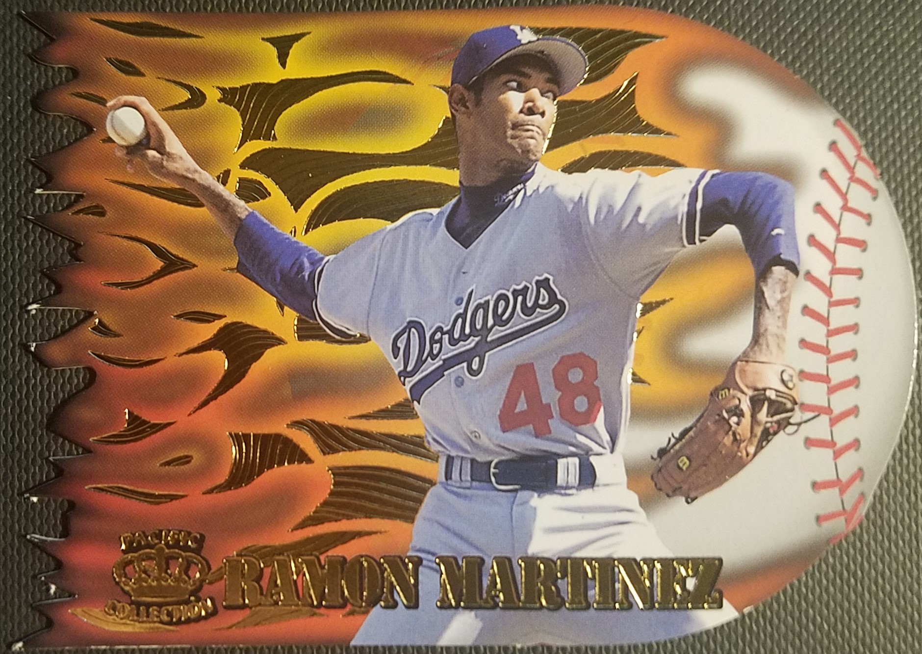
RESCUED: 1996 PACIFIC PRISM RAMON MARTINEZ LANZADORES DE BOLA DURA
AKA FLAME THROWERS. I HOPE YOU APPRECIATE THE PHOTO BECAUSE IT IS PURE HELL TRYING TO GET THE CARD BACK INTO A PENNY SLEEVE WITH ALL THOSE LITTLE POINTS AT THE END OF THE FLAMES. AS YOU CAN SEE, THIS CARD IS FLAMING AMAZEBALLS. IT'S GOT A UNIQUE DESIGN, INTRICATE DIE CUTTING AND SOME REALLY NEAT GOLD FOIL STAMPING AS PART OF THE DESIGN. THESE WERE A ONE IN 73 PACK INSERT SO WERE FAIRLY DIFFICULT TO PULL. ALTHOUGH WHEN A DIE CUT CARD IS INSERTED INTO A TWO CARD PACK, YOU CHANCES OF PULLING ONE INCREASE GREATLY IF YOU'RE THE FIRST PERSON TO GET THEIR HANDS ON THE BOX

THE 1996 PRISM SET IS INTERESTING BECAUSE IT'S THE ONLY ONE TO GET AWAY FROM THE DAZZLING HOLOFOIL PATTERN USED IN THE OTHER PRISM SETS AND PREVIOUS INSERTS, USING AN ODD FOIL PATTERN INSTEAD. IT'S ALSO THE FIRST ONE TO HAVE INSERTS, THIS ONE AND TWO OTHERS WITH HEAVY HEAVY FOIL ALL OVER THEM. THOSE PRISM SETS WERE BRUTAL TO COLLECT, 144 CARDS AT ONE CARD PER PACK PLUS A LOGO FILLER CARD FOR OVER TWO BUCKS A SWING IF YOU COULD EVEN FIND THEM. IT'S FUN TO FIND THEM OUT IN THE WILD BUT YOU MAY BE LOOKING FOR A WHILE
NEW FIND: 1999 STADIUM CLUB JEFF BAGWELL TRIUMVIRATE LUMINOUS
TOPPS GOT THEIR LUNCH EATEN BY JUST ABOUT EVERY OTHER MANUFACTURER OUT THERE IN THE 90S BUT EVERY ONCE IN A WHILE THEY DID SOMETHING WILD LIKE THIS.
TRIUMVERATE WERE A TRULY WEIRD INSERT IN 1998 AND 1999 STADIUM CLUB. EACH 'CARD' WAS THREE DIFFERENT CARDS THAT WERE DIE CUT WITHIN AN INCH OF THEIR LIVES THAT FIT TOGETHER LIKE PUZZLE PIECES. IN ADDITION THERE WERE THREE DIFFERENT VERSIONS OF EACH CARD: LUMINOUS IS BASICALLY CHROME, LUMINESCENT IS A REFRACTOR, AND ILLUMINATOR IS ACETATE. THERE'S ALSO FOOTBALL AND BASKETBALL VERSIONS IF YOU WANT TO TRY TO CHASE YET ANOTHER SCARCE MICHAEL JORDAN INSERT. TOPPS TRIED TO RESURRECT THE CONCEPT FOR STADIUM CLUB IN 2014 AND 2022 BUT THE DIE CUTTING WAS MINIMAL AND THE CARDS ARE LAME

THESE CARDS AREN'T TERRIBLY SCARCE, THERE'S MAYBE A COUPLE THOUSAND OF EACH ACROSS ALL RARITY VERSIONS, BUT THEY'RE STILL A NICE SURPRISE WHEN THEY POP UP. THERE ARE FOUR DIFFERENT DIE-CUT DESIGNS, ONE FOR EACH SERIES IN 98-99. WITH CAREFUL PLANNING YOU CAN GET A TYPE CARD OF EACH DESIGN AND RARITY TO COMPLETE FOUR DIFFERENT PUZZLES. I PULLED A FEW OF THESE BACK IN THE DAY AND WHILE IT'S A GREAT CONCEPT, ACTUALLY PUTTING THE PUZZLE TOGETHER IS EXTREMELY DIFFICULT WITHOUT FEELING LIKE YOU'RE GOING TO DESTROY THE CARDS. MY PERSONAL RANKINGS ON THE DESIGNS ARE:
#3 - 1998 SERIES 1
GLOVE DESIGN
#4 - 1999 SERIES 2
BLOCKS DESIGN
STILL LEFT BEHIND: ALL THOSE NON-DIE CUT EARLY 90S UPPER DECK INSERTS I NEED. I STILL FEEL LIKE THOSE SHOULD BE PRICED AT LIKE A QUARTER
RESCUED: 1998-99 FLEER ULTRA ALLEN IVERSON UNSTOPPABLE

I WAS
VERY COMPELLED TO RESCUE A 1:36 PACKS LATE NINETIES BASKETBALL INSERT OF A HALL OF FAMER. ESPECIALLY ONE THAT I DON'T ALREADY HAVE AN EXAMPLE OF. IT'S JUST SOOOO DAMN UGLY. THIS IS THE FRONT DESIGN WHICH LOOKS LIKE IT SHOULD HAVE BEEN USED AS THE BOX FOR A FLEER METAL SET, NOT A SCARCE INSERT. THERE'S MORE GIMMICKS THOUGH, THE RIGHT SIDE OF THE CARD IS ACTUALLY A FLAP YOU CAN FOLD OVER TO SEE AN ACTUAL FULL SIZED PICTURE OF THE PLAYER. IT LOOKS REALLY GOOD! BUT TO SEE IT YOU HAVE TO FOLD A FOIL CARD IN HALF AND I DO NOT HAVE THE NERVER TO DO SUCH A THING YET. WHICH IS RIDICULOUS, BECAUSE THE CARD IS UGLY AND IT WILL NEVER SELL FOR MORE THAN ABOUT 5-10 BUCKS BUT I'VE BEEN TRAINED SINCE THE EARLY 90S TO
NOT MANGLE RARE, EXPENSIVE CARDS BECAUSE I WILL REGRET IT FOREVER. I'M SUCH A DOOFUS. FOLD THE CARD, IDIOT! BUT I HAVE NOT. HERE'S A
RODMAN CARD ON COMC WHERE YOU CAN SEE WHAT IT LOOKS LIKE. SO MUCH BETTER, RIGHT?! THE PLAYER BUSTING THROUGH THE METAL BASKETBALL LOOKS GREAT. MAYBE ONE DAY I WILL NOT BE A COWARD

HERE'S THE BACK. FOR THE RECORD THE BACK IS NOT NEARLY AS GOOD THE MIDDLE, BUT IT'S SOMETHING. PRETTY TYPICAL FLEER INSERT BACK, REALLY. REHASH OF THE FRONT, SMALL PICTURE OF THE PLAYER, CARD NUMBER IN A RANDOM LOCATION. IT'S FINE
NEW FIND: 2020 PANINI CONTENDERS DRAFT PICKS ANTHONY EDWARDS 2020 DRAFT CLASS
SO FAR MY PICKS HAVE BEEN SOMEWHAT SCARCE 90S INSERTS FROM POPULAR SETS WORTH LIKE 5 BUCKS THAT LOOK COOL AND ARE A BIT OF A BARGAIN. THIS CARD IS NEW, NOT COOL AT ALL, FROM A SET THAT COLLECTORS ACTIVELY HATE AND COULD PROBABLY BE FOUND CHEAPER IF I LOOKED A LITTLE BIT. IT'S GOT AN UGLY PANINI DESIGN TOO! I HAVE NO EXCUSE FOR THIS, I LIKE UNIVERSITY OF GEORGIA CARDS, THIS IS A UNIVERSITY OF GEORGIA CARD, SO I HAD TO GET THE UNIVERSITY OF GEORGIA CARD. THERE ARE ALSO WAY LESS BASKETBALL BULLDOG CARDS AND THIS IS ONE OF AN ACTUAL GOOD PLAYER. SHAME ABOUT BEING STUCK IN MINNESOTA, BUT HE PLAYS GOOD
I DO LIKE THE BACK DESIGN WHERE THEY JUST SAID SCREW IT, GIGANTIC FONT AND CALLED IT A DAY. THERE ARE LIKE A HUNDRED OTHER CARDS I COULD'VE PICKED UP THAT PROBABLY WOULD HAVE BEEN BETTER THAN THIS ONE, BUT TO MY KNOWLEDGE I HAVE NO OTHER ANTHONY EDWARDS CARDS AND THAT COLOR SWAP PACKERS LOGO MAKES ME HAPPY
STILL LEFT BEHIND: I WAS WRONG ABOUT THE WEIRD E-X INSERT LAST TIME, IT WAS ACTUALLY A
TONY BATTIE CARD, NOT SHANE BATTIER. MAH BAD. I'LL PROBABLY REGRET PASSING ON IT ONE DAY SINCE IT'S SUCH AN ODDBALL. I ALSO PASSED ON ALL THOSE HAWKS ROOKIES LIKE HUNTER AND OKONGWU. IT'S STILL UP IN THE AIR IF ANY OF THEM WILL BE LEFT ON THE TEAM IF THE HAWKS HIT THE TRADE MARKET, PLUS I CAN DEFINITELY GET THOSE CHEAPER ONLINE
RESCUED: 1997 SKYBOX E-X 2000 HIDEO NOMO
MAYBE THE BEST SET OF THE 90S. JUST LOOK AT IT. A GIGANTIC PHOTO TAKING UP THE WHOLE CARD ON TOP OF A SHINY HOLOFOIL BORDER FRAMING A WINDOW OF PEACEFUL FLUFFY CLOUDS. I KINDA THINK CARDS PEAKED RIGHT HERE. I BARELY HAVE A QUARTER OF THE SET AND NOW I HAVE SLIGHTLY MORE THAN A QUARTER OF THE SET. IF I SNEAK IN MY BASKETBALL AND FOOTBALL VERSIONS INTO THE PILE. I NEVER BOUGHT ANY PACKS OF THEIS STUFF BECAUSE I WAS ALL 'EW, THAT'S TOO MUCH MONEY FOR NOT ENOUGH CARDS' BUT I'D TRADE A WHOLE BOX OF THE CHEAP JUNK I DID PICK UP FOR A FEW OF THESE NOW

SINCE EX-2000 IS ESSENTIALLY AN ACETATE SET PRINTED ON CARDBOARD, THERE'S NOT A WHOLE LOT YOU CAN DO WITH THE BACK BUT THIS DOES IT WELL ENOUGH. I NEED TO TRACK DOWN A PILE OF THESE SO I CAN PUT THEM IN PAGES WITHOUT HALF OF THEM BEING COMPLETELY EMPTY. I'M ONLY HALF KIDDING ABOUT FRANKENSETTING THIS WITH FOOTBALL AND BASKETBALL CARDS. I MIGHT DO IT IF THE OTHER SPORTS WEREN'T EVEN HARDER TO FIND. I WISH THE 90S SETS I WANTED TO COMPLETE WEREN'T THE ONES EVERYONE ELSE IS HARDING, WHY CAN'T I GET OBSESSED WITH A COLLECTOR'S CHOICE SET FOR ONCE
NEW FIND: 2022 PANINI CHRONICLES PHOENIX RONALD ACUÑA JR.
I LOVE ACUÑA AND I LOVE CHRONICLES SO THIS WAS A PRETTY EASY CHOICE FOR ME ONCE I FOUND IT. THE ACTUAL OFFICIAL BRAVES BOX UP AT THE FRONT OF THE STORE ACUÑA CARDS WERE LIKE FIVE BUCKS A THROW SO THIS WAS A FORTUNATE FIND. I'M HONESTLY A LITTLE NERVOUS THAT RONALD MIGHT REPLACE ONE OF THE CURRENT HOBBY DARLINGS THAT THE WHALES LOVE AND CAUSE PRICES TO GO NUTSO WITH THE SEASON HE'S HAVING. I'M GLAD I'VE BEEN ABLE TO PICK UP SOME CHEAPOS WHILE I CAN. PHOENIX IS A B-TIER CHRONICLES PRODUCT BUT IT'S NICE ENOUGH AND THE SHADES LOOK COOL

MY CURRENT OBSESSION WITH CHRONICLES IS STRANGE EVEN TO ME, BUT I HAVE LEARNED THAT THE TWO CHRONICLES THINGS I ACTUALLY LIKE ARE CHEAP SINGLE CARDS, PREFERABLY OF PLAYERS I LIKE (OR AT LEAST HAVE HEARD OF) AND THE SEVEN DOLLAR RACK PACKS. I SAW SOME BLASTERS AND WHAT THE HELL ARE THEY THINKING CHARGING 25 BUCKS FOR 20 CARDS?? THERE'S EVEN SOME 15 DOLLAR 30 CARD RACK PACKS, WHO IS BUYING THE RIPOFF BLASTERS. THE 2022-23 NBA SET IS ABOUT TO BE RELEASED AND I'M GOING TO HAVE TO USE SOME RESTRAINT AND JUST LIMIT MYSELF TO A SINGLE PACK. THE CARDS I REALLY WANT ARE ALL TRAE AND EVERYONE HATES HIM RIGHT NOW SO I'D PROBABLY BE BETTER OFF PICKING THEM UP INDIVIDUALLY. I WONDER IF THOSE PACKS WILL LINGER FOR MONTHS AND MONTHS LIKE THE DRAFT PACKS HAVE. I WISH THE BASEBALL PACKS WOULD DO THE SAME
STILL LEFT BEHIND: THERE WAS A CRAPLOAD OF RECENT STADIUM CLUB BRAVES CARDS IN THE BOX AND THE AUSTIN RILEY CARD OF HIM CELEBRATING AND POPPING CHAMPAIGNE HURT TO PASS UP. I ALSO FOUND A DIFFERENT ACUÑA CARD FROM CHROME UPDATE BUT I LIKE CHRONICLES BETTER. I ALSO ALSO FOUND ANOTHER E-X 2000 CARD, THIS TIME OF NOMAR GARCIAPARRA. YEP, I NEED IT. UGH, MAYBE I NEED TO GO HIT THE DOLLAR BOX ON MY LUNCH BREAK
SO WHAT HAVE WE LEARNED? FIRST, I AM UPPING MY DOLLAR BOX LIMIT TO 6 CARDS. EVERY TIME I TRY TO KEEP IT TO FIVE BUCKS I FIND SIX CARDS. NOW I WILL FIND SEVEN CARDS I CAN'T PASS UP INSTEAD. HOORAY! MORE CARDS! I'M ALSO NOTICING THAT WITH THE TIGHT LIMITS I'M MOSTLY GOING FOR THE NICEST CARDS THAT FIT A SET OR PLAYER COLLECTION MIXED IN WITH SOME NICE SHINY INSERTS THAT DAZZLE MY EYES. THAT'S ACTUALLY A PRETTY GOOD FOCUS, AT LEAST FOR ME. WE AREN'T DONE WITH THE DOLLAR BOXES EITHER, BUT THAT'S ANOTHER POST
IF I LOSE MY MIND AND BUILD A TRIUMVIRATE FRANKENCARD OR FOLD ANY INSERTS YOU ALL WILL BE THE FIRST TO KNOW