I have no idea how to create pages but I'll figure it out eventually godammit

Showing posts with label Babe Ruth. Show all posts

Thursday, January 5, 2017

Favorite Card of 2016

Because P-Town Tom wants to know.

So this is my favorite set:


And this is my favorite player:


So this should really be a no brainer, right?


BUT THEN....

HOLY CRIMINY JEEBUS

BABE RUTH WITH A MONKEY


Dem bootleggers at Leaf done threw me a knuckleball. Babe Ruth is an all-time fave and I have a weird affinity for gorillas and apes and monkeys and such. And yes I know Mike is a chimpanzee, not a monkey. It says it right on the card. But when I pulled this card from the pack this was my reaction:


This is actually a really nice set, so if you see one in a discount blaster bin I highly recommend picking it up.

Sorry Jason, you got a ring this year. So you got that going for ya. Which is nice.

Sunday, December 18, 2016

The Twelve Days of Setsmas - Day 4: Bubba Roof

SO
The past two days of Setsmas were postponed on account of work.
This annoyed the frustrated perfectionist in me and I almost cancelled Christmas but I had a day off to myself and thought better of it
now I am just going to post twelve sets vaguely in the vicinity of December and not stress out  about blawg posts about baseball cards.
Here's a set, man, or whatever, I don't even care

2016 Leaf Babe Ruth Collection

If forced at gunpoint to provide a HOTTT TAEK on Nouveau Leaf my general opinion would be that most of their stuff is hot buttered garbage that I don't care about at all. It's all out of my price range anyway so it's not a problem, BUT.... this year they did a Babe Ruth tribute set much like their Pete Rose tribute sets that seem to show up everywhere and their Stan Musial sort-of tribute set/sticker dump that I never see anywhere. A blaster was out of my price range again BUT..... they showed up in the Target discount blaster section so I snagged one because BABE RUTH IS AWESOME. Was not expecting to get a complete set in a blaster! No relics or autos or whatever but a complete set is a glorious thing in itself. The set looks really good too, as long as you're not allergic to sepia. A 100 card set divided into an 80-card base set and two 10-card 'insert' sets pages out like ass though. MY SOLUTION: Surround Card #1 with 8 other Ruth cards, tack on cards #1 from the two insert sets to the end of the base set then have a page each for the inserts. I don't know if it works or not but at least I'm trying!


 See if you can spot the greatest card in the history in the Multiverse!

Tomorrow(?): I have plans!


Tuesday, September 18, 2012

Monday, January 24, 2011

Relax guys...

Everybody just calm down. It could be worse you know...


It can always be worse...

Thursday, May 13, 2010

A good pack spoiled

I ended up on another late night Wally World mission tonight. I didn't wanna go, but sometimes you have to make sacrifices. I sacrificed by picking up a few packs of Topps out of boredom. I was hoping for a code card or two to hold in reserve. It's a giant march of the late '70s in there right now so I won't be redeeming any anytime soon, but it's nice to have 'em just in case. I unfortunately got none, but I did get what could have been an awesome pack if not for a horrible flaw. My flaw, let me show it to you.

93 Joe Nathan

Joe's decent, too bad he's hurt. There's an odd baseball stitching shaped bump on the front of the card. I have no clue how it got there.

148 Cody Ross

Fish annoy me, but this is a great photo.

273 Pat Neshek

The patron saint of card bloggers. One of these days I need to get over my irrational fear of pestering celebrities and send a card to Pat to get signed.

100 Albert Pujols

Keeping the 'Best Player in Baseball by a Wide Margin" seat warm for Jason Heyward for the next few years. Gotta love pullin' an Albert. 

20 Tommy Hanson

YEEEAH TOMMY. The dude's been in the league less than a year and he's already the Ace of the staff. This is shaping up to be a hell of a pack and we haven't even gotten to the inserts yet.

259 Daniel Hudson

Don't know who he is, but he's a rookie. Next is the last card before the inserts, let's see what we go-

NOOOOOOOOOOOOOOOOOOOOOO
OOOOOOOOOOOOOOOOO
OOOOOOOOOO
OOOOO
OOO
O


I hate everything about this card. Fffff - I just - auugh. Does someone need this? please take it from me.

TR39 Vlad Guerrero Turkey Red

I need this card but I can't enjoy it. The pain is too fresh.

No 1 in a series of 45 Babe Ruth Blue Back

Oh thank goodness, the power of a Good Yankee can overpower the power of an Evil one. This is the perfect card to sooth my shaken spirit.

TTT6 Ichiro ToppsTown

Any Ichiro is a good Ichiro. Things are starting to seem normal again. I finally tried out Topps Town and I was not impressed. My kid might like it though, so I think I'll give him my codes this weekend and let him go to town, so to speak.

50 Zach Grienke

I got a bunch of Greinke cards in the packs I got. Just one of those weird collation quirks I guess. All of them are going in a package I am mailing to Heartbreaking cards tomorrow 'cuz I really just don't need 'em. Matt is happy I got stuck at work today and had no time to hit the post office now.

113 Willy Tavares

Nice looking card of Willy about to try to beat out an infield hit.

That could have been a very good pack if not for the awfulness. I will try to think of the pleasant cards like Hanson and Ruth instead of gimmicky abominations. I just need to remember that this too shall pass.

Tuesday, April 20, 2010

Derek Lowe is not the only Lucky Bastige out there

The day after declaring his intention to collect every single Ken Griffey Jr. card from his second go-around with the Mariners (something I had planned to do with Ken when he was seemingly going to sign with the Braves), He ends up getting one of the scarcest Griffey releases in Thorzul's A Piece of History group break. What are the odds?

I do know the odds of getting this:


If you're keeping track, that's three lucky bastiges, Derek, Matt and me. I pulled this Babe Ruth Chase '61 Variation out of a retail pack last week. I was killing time on my lunch break and went to Wally world for a couple packs of Heritage and some popcorn shrimp when the Babe made his appearance. When I saw what I had pulled I nearly pyew- wait, no. I was very excited by my good fortune. I'm not inspiring Thorzul any more.


I consider this card to be a variation and not a gimmick. Basically because Topps put the odds on the pack. the stupid stealth color variation cards that no one would ever be able to pick out in a million years without having a doctorate in advanced cardology, those mickeyfickeys are gimmicks. I love variations, gimmicks not so much. This is a pretty sweet looking card even though the design is as boring as a box of rocks. The Babe tends to bring up everything around him to his level. The only complaint I have about the card is the fact that the stats on the back are near microscopic. That's pretty nitpicky though, I'll just have to get the Sherlock Holmes magnifying glass out when I look at the card and be happy about it. So what's the chance of pulling this beast?.

There are three of the Chase '61 variations that fall at 1:435 retail packs. I got extra lucky and got Ruth over Maris and the overdone Mantle versions. Sure this card is tough, but how tough is it compared to any of the other cards in the set? there's a lot of short prints out there, and there's only three of these suckers. Let's check out the approximate odds for pulling any single card from the set.

Base cards: You get about 7 in a pack and there are 425 of them. 425 divided by 7 gives you a ratio of about 1:60 packs to pull any single base card.
Short prints: these are one in every three packs. Since there are 75 of them, you're looking at 1:225 packs to snag that one short print you need to complete your set.
Dice back variations: I kinda want to collect this set, but I'm so far behind in trading that I don't dare go begging for them. Seriously, I suck right now. Sorry to anyone waiting on cards from me. There are 18 of those cards and at 1:72 packs you're looking at odds of 1:1296 to pull that Pujols for your collection.
Chase '61 variation: Three cards, 1:435 odds. are these the hardest to pull? Do the path. 3x435 = 1:1305 packs. So really, these are about as tough as the dice backs. Even so, pulling the Ruth out of retail makes me the king lucky bastige for the week.

Two more lucky bastiges tonight:
Tommy Hanson for getting taken off the hook for a loss by two-out homers from Troy Glaus and the J-Hey kid with two outs in the ninth.
Billy Wagner for getting the win courtesy an improbable walk-off homer by Mr Slump Nate McLouth.

Actually all Braves fans are lucky bastiges tonight!

Sunday, January 10, 2010

Apparently Michael Eisner is a small, fluffy animal

Because I want to torturously massacre them!*

(I was going to embed a Happy Tree Friends video here but seriously they are disgusting. blugh)

Ok, so the Chipper Ruth card was based on an actual picture of Babe Ruth (and a rather famous one at that). It still doesn't look like Ruth. The eyes are wrong, the mouth is really wrong but the nose is actually a lot closer than I thought. I'm used to the older Ruth's Roman nose where it started roamin' all over his face. The younger Ruth nose is more in line with the original photo. Now, I don't want to bust on the artist, I wish I could paint like that. Art doesn't have to be perfect (hell, I said as much in my original rant) but in portrait painting the painting of your subject really needs to be recognizable as that person. That portrait is not instantly recognizable as Ruth. If Ruth was in a Yankees uni, yeah, that would be a decent portrait of Ruth. But in a 2009 Braves alternate home jersey it's just too confusing because that face does not instantly scream "Ruth". Babe Ruth is the most recognizable ballplayer on the planet, people KNOW what Babe Ruth looks like. Good idea, poor execution.

The vast majority of first reactions to this card is that it's Chipper Jones and not Ruth. I tried to explain in my post why we are reacting that way because the author seemed to be honestly surprised at this obvious reaction. I also explained very succinctly why the reaction is so negative, mainly because we're all tired of Topps jerking us around with nonsense. After all the gimmicks of the past few years, when we see what appears to be a Chipper Jones card with Babe Ruth's name on it warning bells start ringing, alerting SHENANIGANS. And why not? Since 2006 Topps has given us a steady diet of ridiculous chase cards that are designed to promote sales of the product but only serve to devalue the base product. And judging from all the deeply discounted boxes of gimmicked up Topps product out there, it hasn't even boosted the sales. Oh well.

That's enough Chicle for me (well, except for maybe the contest!) right now. I made my point. If you couldn't find the point in that long rambling torturous mess of a post, here it is:
  1. Don't freak out about National Chicle
  2. If all the base cards look like that Jackie Robinson it will be kickass
  3. Some of the subset cards are goofy and/or ugly but they could be fun
  4. You wanted an art set after Upper Deck killed Masterpieces well here ya go
  5. I don't care what they say that is Chipper Jones not Babe Ruth
And remember kids:

If it walks like a duck and quacks like a duck it must be a penguin

Two and two always makes five

Chipper Jones is Babe Ruth

And THE BUMS ALWAYS LOSE.

*metaphorically, of course.**
** I don't really have bad feelings against Eisner, he's just the main face to a company that has been constantly infuriating me the past few years and I am merely burning him in effigy in a literary fashion so to speak in order to vent my frustrations and experience the catharsis of such an act.***
*** Oh who am I kidding, this is all admissible in court and I'm utterly screwed aren't I?

This is why, Beckett

Wherein dayf drops the first MF-bomb of the new decade in bold large red font... so be warned little children. Here there be Dragons.

Ok, so I'm a day late on the whole National Chicle brouhaha but I'm pretty much late on everything nowadays so no big deal. If this is the only baseball card blog you read (you should really check out some of those guys on the sidebar, but I digress) here's basically what happened over the past 48 hours. On Friday, Beckett posted a preview of 2010 Topps National Chicle. (Political junkies know that bad news is always released on a Friday but once again, I digress). Chris Harris took one look at it, choked down the vomit, and posted this scathing review on Stale Gum. (I rather like the Ichiro with the Pilots uniform, but I'm digressing yet again) All hell breaks loose on the card blogs and Chris Olds (who is secretly a follower of Stale Gum - argh digressing!) (apparently not, who knew?) looks around at the carnage and posts a followup where he basically says "whaaaaaaaaa?" in Jon Stewart's voice. So now all you normal people who only check the card blogs maybe once a week while relaxing on a Sunday morning are caught up. Now, before I discuss Chris Olds' "Why?", I'd first like to discuss the rest of the blogosphere (yes, I'm going to keep using that term, I don't care if everybody else hates it-ACK DIGRESSING AGAIN) *ahem* the rest of the blogosphere's question of "Why??".

As in "Why the hell does this product even exist??"

Beyond the obvious answers of "Retro always sells", "It sticks it to Upper Deck Who already did this set with 2007 Goudey and 2009 Philadelphia" and "Because they Can." here is one other reason why this particular design is being used in this particular set. I'm not talking about card design, I'm talking about art design. This set exists in this form because you all went batshit over Topps Sketch Cards. Here's a few sketch cards that made it out into the wild. Compare the art with some of the art from that preview. I'll bet a binder that this guy did some of the artwork in this set. National Chicle is not just a retro set, it's an ART set.

Topps has a whole stable of artists sketching up 1/1 insert cards for not only baseball, but all their non-sports products too. These sketch cards are WILDLY popular. There is a great history of artistic sets going back through card history: Upper Deck Masterpieces... Upper Deck Checklists... Dick Perez Diamond Kings... 1953 Topps... 1935 National Chicle... Topps has the artists working for them already, why not have them work on a set? Now, the thing with art, see, is that it is usually not exactly photorealistic. It is sort of... well, artsy, and some artyness is better than others. So in the same set you can have some fantastic art, and other art that is not so good. Since that's just the nature of art, I would advise my fellow bloggers not to abandon this set - or indeed the entire hobby itself - over a couple of clunkers in the sell sheet of an art set. Give it some time, let some more images come out, heck, Topps might even be reading all of this stuff and ordering their design team to work weekends for the next month to fix some of these problems, and just wait and see how the final product turns out. You might be pleasantly surprised. Just look at that Jackie Robinson card again and imagine an entire base set that looks like that.

Ok, now onto Chris Olds' question: "Why are people freaking out over these previews??"

The best way to address this is by dissecting the Stale Gum post which was strongly alluded to, if not directly linked, in the Beckett article. Chris Harris has issues with three of the cards in the preview. One, Ichiro in a Pilots uniform is mostly an anachronistic thing. Yeah, the Pilots were based in Seattle, but they eventually moved to Milwaukee, which is a completely different franchise than the Mariners. Ok, so the Pilots are technically not the Mariners, but it's the same city and it's no more odd than Greg Maddux wearing an Atlanta Black Crackers Negro League throwback which he did in real life. Of course, as a dedicated collector, Chris has every right to hate this card. I personally am still so angry with Topps over their Black Border blaster bait & switch that if I was strolling down the street and came upon Michael Eisner on fire, I not only would not piss on him, but I would roast marshmallows and sing campfire songs as he burned to death. Collectors are funny that way.

Now for card #2, the weird Beckham/Konerko/Maybe Even Thome 1990 Frank Thomas No-Name Variation Homage Card Thingy. This card is just so wrong on many different levels. First of all, a 1990 Topps card does not belong anywhere near a 1930's retro set. It just doesn't. Even the Thomas error or the President Bush '90 Topps card is simply not worthy of being in the same binder as any card from the 1930's. I mean, it's cute and all, Beckham was a 1st rounder, Big Hurt was a first rounder... this just isn't the time or place for it. And making it one of the first cards shown of the set just isn't a smart move. Especially when aesthetically speaking it's just a plain butt-ugly card. Even the White Sox fan hates it and that's saying something.

Ok, now for THE card. The card that has made many heads asplode this weekend. I'm talkin' 'bout this:
Hrm. A Chicle card of Chipper Jones. What's the big deal? I mean, the red jersey is ugly as sin, but that's the fault of the Braves' marketing department, not Topps so why are people what WHAT WHAAAAAT???

Babe Ruth? That's Babe Ruth?? Um, if you say so Topps...

Here's Babe Ruth:


And here's Chipper Jones:

And here's that card again:

And here's Babe Ruth in a Braves uniform:

He's the one on the right...

The card again:
Ok, that don't look like Babe Ruth. That looks like Chipper Jones in a red Braves Home Sunday alternate uniform. The nose and mouth especially are all wrong for Babe. Let's be all Mythbusters scientific about this. Here are Babe, Whoever that dude is and Chipper all side by side:

Still looks like Chipper. Wait, unknown dude has eyeblack. Here they are with eyeblack:

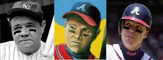
Forget for a moment that no ballplayer would be caught dead with eyeblack in 1935. I guess it kiiiinda sorta looks like Ruth if you squint- um, actually no it doesn't. it looks even more like Chipper there. It could be the uniform though. Chipper Jones is Mr. Brave, it's natural that when we look at a painting of a guy in a Braves uniform, that it would look like Chipper. Here's Mr. Generic wearing Yankee Pinstripes.

Now I'm frightened and sad because The Yankees just signed Chipper Jones. Alright, the face isn't really a good indicator, it's too subjective. It can look like who we want it to look. Here's a better test: the three guys' torsos:

Ok, if that card is supposed to be Babe Ruth, then I'M Chipper Jones. Look at how fat Babe is there and that's back when he was a Yankee. He was even fatter as a Brave. Some guy painted Chipper Jones with kind of an odd face and Topps decided they'd be slick and try to pass it off as Babe Ruth. Babe Ruth, probably the most recognizable baseball player that ever lived. Even though it doesn't look a damn thing like Babe Ruth and it's quite blatantly Chipper Jones to anyone who might look at it. Consider this: if you were an artist, and Topps commissioned you to paint a picture of Babe Ruth in a 2009 Braves uniform WOULD YOU PAINT THEM A PICTURE OF CHIPPER JONES? No, you wouldn't. That would be just plain stupid.

This is why everyone hates this card. Because Topps took what was obviously a painting of Chipper Jones and got cute and put Babe Ruth's name on the card just to fuck with us. "Oh, but Babe Ruth played for the Braves in 1935..." yeah, he sure did and that's STILL a painting of Chipper Jones and Topps STILL put Babe Ruth's name next to it. I don't care if it's supposed to be a 'fun' card, two plus two is not five, and Chipper Jones is not Babe Ruth, no matter what Topps says. Newsflash for Topps: collectors are sick and fucking tired of this shit. They are tired of John Smoltz and Tom Glavine's names being spelled Jon Smoltz and Thom Glavine. They are tired of Johan Santana's first Topps cards in a Mets uniform being unobtainable super short prints. They are tired of Rangers logos on Padres cards and photos being flipped both horizontally and vertically on purpose and the names of two marginal Giants outfielders being swapped on each other's cards and an extra unnumbered card of the hottest rookie of the year tacked onto the greatest set building brand Topps has in their entire product line for no other fucking reason than to shove another goddamn gimmick right up our asses in the vain hopes that it will trigger another '06 Alex Gordon feeding frenzy. WE ARE TIRED OF THE BULLSHIT, TOPPS, AND WE WOULD VERY MUCH LIKE IT TO STOP NOW THAT YOU HAVE AN EXCLUSIVE MOTHERFUCKING LICENSE. This, Beckett; this, Topps; this, Chris Olds; this is why people are so irritated by this silly little card that they are threatening to boycott the only licensed manufacturer of friggin' baseball cards over it.

I don't hate it though, I love it. I want this card very badly and I'll gladly take it off the hands of anyone who pulls it and hates it. That's because Chipper Jones is my favorite player and it's quite obviously a Chipper Jones card no matter whose name is on the thing. I will take this card and love it and scan it and post it to Zistle and put it in a top loader and put it with my other thousand Chipper Jones cards because it's a dadgum Chipper Jones card. That card is not why I'm infuriated with 2010 Topps National Chicle. THIS is the reason I'm infuriated with 2010 Topps National Chicle:
Tommy Hanson does NOT have a pedo-stashe!!! Who the hell painted this?? Why would they DO that??? WHY?????