HOOOO-WEEE, GOT A BIG PILE OF CARDS FROM MARK, AKA IDRAWBASEBALLCARDS AKA STATS ON THE BACK AND INCLUDED IN THE PILE WAS A WHOLE SET OF ART CARDS
AN 80S RETROSPECTIVE WITH A CARD DESIGN FROM EVERY YEAR OF THE DECADE. THIS IS FANTASTIC AND I SHALL NOW POST THE SET WITH MY OWN PARTICULAR BRAND OF QUIPPY COMMENTARY. YOU'LL SEE THE OTHER CARDS IN A FEW MONTHS WHEN I GET AROUND TO POSTING IT. IF YOU'D LIKE YOUR OWN SET TO COMMENT UPON, YOU CAN GET IT HERE SUPER CHEAP
MAYBE THE GREATEST CHECKLIST CARD IN HISTORY. THE BEAUTIFUL MUG OF KENT TEKULVE AND A FANTASTIC CARD LIST. ROWLAND! MOOKIE! RICKEY RICKEY RICKEY!!! I THINK THIS SET WAS DESIGNED SPECIFICALLY FOR ME. THERE'S SOME MYSTERIES IN HERE TOO, WHO IS THE GREATEST PITCHER? WHAT IF DONRUSS GOT GRIFFEY? GREAT SCOTT! IS THERE A CHRISTOPHER LLOYD CARD IN THIS SET? STAY TUNED AND FIND OUT
THE BACKS OF THE CARDS LOOK LIKE THIS. VERY PRE-WAR DESIGN HERE (PRE WORLD WAR ONE THAT IS), VERY SIMPLE AND ELEGANT. SWIRLY RIBBONS ARE HARD TO DRAW, I APPRECIATE THE ATTENTION TO DETAIL. AS YOU CAN SEE I WAS BLESSED WITH THE FIRST OF FIFTY SETS, I CAN MAKE SOME BIG COIN ON EBAY WITH THIS BUT I'LL NEVER DO IT
MARK OBVIOUSLY WATCHED THE GREAT DORKTOWN SERIES ON DAVE STIEB, HE EVEN HAS A CAMEO OF THE VILLAIN JACK MORRIS IN THE STANDS. I HIGHTLY RECOMMEND WATCHING THAT SERIES EVEN THOUGH IT'S LIKE FOUR HOURS LONG, ALL OF THE SECRET BASE DEEP DIVE VIDEOS ARE GREAT BUT THIS ONE IS EXCEPTIONAL. YOU'LL BE DRIVING UP TO COOPERSTOWN WITH A PITCHFORK AND VALUE PACK OF TORCHES BEFORE YOU'RE EVEN DONE WITH PART THREE. THE 1980 CARD OF DAVE IS A GREAT ONE, VERY GOOD CHOICE
BRAVES LEGEND ROWLAND OFFICE FROM HIS 1981 FLEER CARD. IT PAINS ME TO SAY AS A BRAVES FAN THAT THIS IS PROBABLY ROWLAND'S MOST ICONIC CARD AND THIS MIGHT BE THE BEST LOOKING VERSION OF IT. YOU NEED FOURTEEN UNIQUE ROWLAND OFFICE CARDS TO BREAK INTO THE TOP TEN COLLECTORS ON TCDB AND I'M WONDERING IF I'VE ACCUMULATED THAT MANY ON ACCIDENT NOW
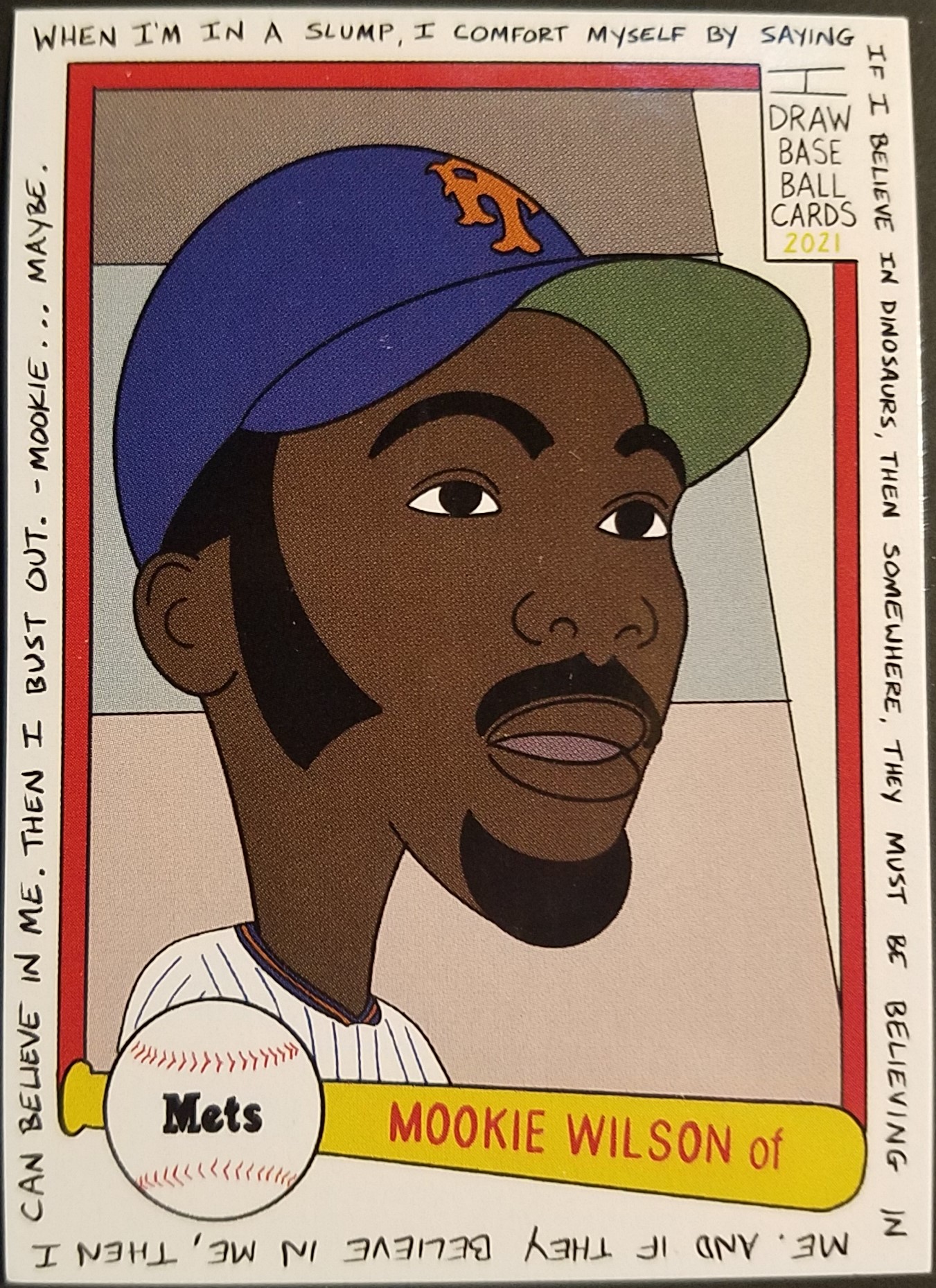
1982 GIVES US A DONRUSS MOOKIE WITH BONUS INSPIRATIONAL MESSAGE. THIS CARD MEANS A LOT TO ME. I LOVE MOOKIE, I LOVE 1982 DONRUSS AND I LOVE DINOSAURS. IN A WEIRD COINCIDENCE, THIS IS MY CURRENT FANTASY BASEBALL NAME:
IF I BELIEVE IN MOOKIE, THEN SOMEWHERE, MOOKIE MUST BE BELIEVING IN ME. AND IF HE BELIEVES IN ME, THEN I CAN BELIEVE IN ME. THEN I CAN FINISH WRITING THE DOZENS OF POSTS IN MY DRAFT FOLDER
OR MAYBE I'M A DINOSAUR? NOT SURE HOW THAT WORKS
1983 BRINGS US FULL SURREALISM AS FRANK VIOLA TURNS INTO HIS NAMESAKE. I FORGOT FRANK WON 24 GAMES AND A CY YOUNG AWARD IN 88 AND WAS REWARDED BY GETTING TRADED TO THE METS. THAT'S A TERRIBLE FATE FOR SWEET MUSIC BUT IT MIGHT'VE HELPED THE TWINS WIN ANOTHER WORLD SERIES. AGAINST US 😡
1984 TOPPS RICKEY MADE WITH LINES! I DON'T EVEN KNOW WHAT THIS STYLE OF ART IS CALLED. IT'S ABSTRACT BUT NOT REALLY DE STIJL ABSTRACT AND 'LINE ART' DOESN'T QUITE CUT IT EITHER. WHATEVER IT IS IT'S AMAZING AND IT'S PROBABLY MY FAVORITE IN THE BUNCH
MIKE SCOTT IS ANOTHER 80S PITCHER THAT EVERYONE HAS FORGOTTEN ABOUT HOW GOOD THEY WERE. 86 WINS, OVER A THOUSAND STRIKEOUTS AND AN ERA UNDER 3.00 FROM 1985 TO 1989. AND DON'T FORGET THE CY YOUNG WIN. THIS IS THE CARD I THINK OF WHEN I HEAR THE NAME MIKE SCOTT, ODDLY ENOUGH. IT'S MORE ICONIC THAN I THOUGHT
WOOOO! A BARVE! I FRIGGIN LOVE 1986 TOPPS AND I'M VERY HAPPY THAT DALE MADE THE CUT AMONG ALL THE EXCELLENT CARDS IN THAT SET. THE HAND DRAWN TEAM LETTERING LOOKS AMAZING I WANT AN ENTIRE SET WITH THAT LETTERING. NO PLAYERS, JUST LETTERING
1987 TOPPS IS OVERRATED! YOU SCREAM INTO THE VOID AND THEN THE VOID REMINDS YOU THAT THE 1987 TOPPS BO JACKSON EXISTS AND YOU HAVE TO RETHINK YOUR LIFE CHOICES. IT IS KINDA OVERRATED BUT THERE CERTAINLY ARE QUITE A FEW HELLA GOOD CARDS IN THERE. THE ONLY THING THAT CAN MAKE THE BO JACKSON CARD BETTER IS A FUTURE STARS RAINBOW AND THE COOL BO ROYALS LOGO
THIS IS A GOOD QUESTION: WHAT IF DONRUSS HAD JUMPED THE GUN AND PUT GRIFFEY JR IN THEIR 1988 SET? IT WOULD BE A PRETTY BOLD CHOICE SINCE HE HAD ONLY PLAYED IN BELLINGHAM IN 1987. IT PROBABLY WOULDN'T HAVE CAUSED THE HOBBY FREAKOUTS THAT HAPPENED IN 1989 SINCE GRIFFEY ONLY GOT TO DOUBLE-A IN 1988. BUT IT WOULD HAVE REALLY STUCK IT TO UPPER DECK WHICH MIGHT'VE TORN APART THE FABRIC OF THE KNOWN UNIVERSE, SO I APPROVE. I LIKE 1988 DONRUSS' FUNKY BORDERS, THIS IS A GOOD LOOKIN CARD
LAST CARD IS THE 1989 TOPPS FRED HALL OF FAMER MCGRIFF WITH ANOTHER CAMEO APPEARANCE IN THE STANDS OF MCGRUFF THE CRIME DOG. I'M STILL OVER THE MOON THAT FRED FINALLY GOT INTO THE HALL AND I'M VERY HAPPY HE MADE THE 80'S CUT. 1989 TOPPS HAS GROWN ON ME OVER THE YEARS, PROBABLY BECAUSE THERE'S NO ICONIC GRIFFEY OR NAUGHTY WORDS TO CAUSE IT TO GET OVEREXPOSED. YES I KNOW JUNIOR'S IN THE TRADED SET, WHEN'S THE LAST TIME SOME INFLUENCER POSTED A GRADED ONE OF THOSE ON THE SOCIAL MEDIAS
WHAT A LOVELY SET, IT MAKES ME WANT TO GO DIGGING THROUGH ALL MY JUNK WAX DOUBLES LOOKING FOR TREASURES. SADLY DUE TO SLOTH AND PROCRASTINATION I HAVE BURNED THROUGH MY TWO WEEK POST BUFFER AND I NEED TO WRITE MOAR POSTS INSTEAD. THE ACTUAL CARDS CARDS FROM MARK WILL BE UP SOONER OR LATER AND MIGHT BE SEVERAL POSTS SINCE HE SENT ME A TON OF EM. IN THE MEANTIME YOU CAN LISTEN TO MARK'S PODCAST OR GO BUY YOUR OWN COOL ART SETS
Ferris Bueller's Day off is one of my favorite movies. Not because of Ferris, I can't identify with him other than the fact that I had a computer before I had a car. I identify with Cameron. I worry too much. I'm too grouchy for my own good. I overthink things. I occasionally get to hang out with cool people doing cool things and I'm just lucky to be there. Heck, I'm a Detroit Red Wings fan pretty much because Cameron wore a Gordie Howe jersey in that movie.
Three scenes define that movie for me. "Ferris Bueller, you're my hero" is one of my favorite lines of all time. The baseball scenes are wonderful simply because the Cubs are playing the Braves. The best scene is the one in the museum. Ever since the first time I saw this scene it grabbed me by the throat and shook me to the core. While normal people are off snogging, Cameron and I are getting lost in a painting. Their animalistic hormonal jollies will never match the bliss of losing oneself in a masterpiece. Cameron in a Seurat. Me in a Finster. Or Dali. Or Miro.
I watched the film last night and decided to paint something for myself to take a break from the stuff I'm painting for other people. So I painted Cameron. Losing himself in that little girl's face in Seurat's painting. I'm happy with how it came out.
This was painted on a canvasy 9x12" paper for acrylic paints. Six colors were used: Black, white, blue, brown, suede and fuchsia. It was originally going to be a quick half-hour painting but took about two. A goodly amount of vodka aided the creative process. Here's the reference photo I used.
And the scene it came from.
Don't really have anything more to say, there's not much I can do to tie this into baseball, which is what this blog is supposedly about. Well, nothing other than HEEEEEEEEEY BATTER BATTER BATTER SAWIIIIIIIING BATTER HECANTHITHECANTHITHECANTHIT SAWIIING BATTER. So relax and enjoy the arts. I'm going to the Braves' open house tomorrow so maybe you'll get some good pics by Sunday.
The artist bit of me is all squee but the collector in me is all nope nope nope nope NOPE. This guy does these paintings so well that I just might need to hide the really old vintage binder for a couple weeks lest I become inspired.
Or learn how to draw smaller. Or, better yet, learn how to fit everything into the space I want it to go in. You might have noticed the header has changed.
Yes, I know it's huge. It's only going to be up tonight. It's Halloween! Gotta celebrate! Plus the banner I wanted to put up isn't ready yet. So instead of working on that I took an hour or so to draw this because I am hyper efficient with my time. I screwed up with drawing it so the masterpiece above is actually two different drawings cobbled together using the magic of MSPaint. Here's part 1:
I drew Pipsqueak first, then Pinkie on a separate piece of paper when I realized she'd never fit, then did the lettering last because I suck at lettering. I also really, really suck at leaving enough space for text. I did that LAST and I still ran out of room. With over an inch of white space to the left of it. Guuuuuuuuh.
Here's Pinkie. I find Pinkie in a chicken suit to be the funniest thing ever. Don't pay any attention to the bottom right corner as I half assed the feather ruffle and gave Pinkie some serious thunder thighs. That'll happen after too much candy.
Here's a first draft of Pinkie. I got halfway through and realized I didn't like the face. I went ahead and finished it anyway just for the practice. Drawing that folded up arm a couple of times helped.
Here's the original screenshot I based it on. I got full body Pipsqueak and Pinkie's face from a couple other moments in the scene and mashed them all together. Then I mashed all that together in MSPaint. took a couple of hours total with the help of a couple of Yuenglings and some mixes from here.
There's LOTS more Halloween stuff scheduled for today, muahaha!
The first batch of sketch cards have mostly reached their recipients. I'mma start posting them now anyway.
The first one I did (after my Al Hrabosky from a few months ago) was of The Phillie Phanatic. This one went to Stale Gum along with a pile of stickers. Here 'tis, just in case you haven't seen it on Stale Gum already.
Drawn on 9/13/11
Media: #2 pencil on one of those thick decoy cards out of a pack of Gypsy Queen
So why the Phanatic? A couple of reasons. Chris is a Phillie Phan, so I wanted to draw a Phillie for him. Chris is also primarily a set collector, so I don't really know his favorite player even after trading with him for what? Four years now? So, a card for a generic Phillie Phan should get the Phanatic. Plus I had only been drawing regularly for a couple of weeks at this point and sketching a big fuzzy critter is a lot easier than trying to figure out Ryan Howard's face. Besides, the Phanatic is Phun! I almost want to do another one with colored pencil this time.
Here's the back. Backs are tough. Just look at Topps Lineage. As you can see I'll never be a letterer. I went with the typical "hit" card boilerplate on the back of this one. Not sure if Topps' lawyers would ever allow them to promise that a collector could ever be lucky enough to get tripped by Matt Diaz though.
Thanks to social networking I can't play it off like I'm celebrating because it's Eddie Mathews' or Margaret Thatcher's birthday anymore so I'll fess up. It's my birthday. I'm as old as Jack Benny now, so this is officially my last birthday until I'm old enough that it's advantageous to skew my age up instead of down. For a last official birthday, this has been a pretty damn good one so far.
The kids were disgusted about going to school so they didn't wake me up 3 hours early and jump on my face when I'm half asleep as is their custom. I got to wake up at a decent hour and nom on some french toast that was made for my daughter's teacher appreciation day. After dropping off the kids at school and grabbing a large coffee at the Dunks it was off to this:
The exhibit officially opens this Saturday but I'm a member of the High, so I get to drool over the goodies before the unwashed masses. The advertisement says 12 Modern Masters, but I think there were actually 14 artists on display. I guess the extra two are so you can take your two least favorite artists of the bunch, chuck them into your own personal "talentless hack" bin and still say you got to see 12 masters. I personally am but an overgrown monkey scribbling away with #2 pencils on printer paper, so I have no right to talk smack about anyone in any museum so I'm gonna go with 14 masters on display. Maybe 13 or 15. I wrote 'em all down, but I forgot to bring my cheat sheet with me into my office to type up the post so you'll just have to go see it for yourself, or demand that I do a post with all the artists. Yes, this is now a baseball card+ponies+art blog whether you like it or not.
The exhibit is fantastic. Picasso is just Picasso. That man did shit with lines that is mindbending. I'm going back again sometime just to stare at his sketches for an hour to try to figure out what the hell he was doing. I also got a new appreciation for Matisse, I have never been a fan because his stuff (especially the later cutout work) seemed kinda simplistic. When you see the paintings in person, it's actually quite amazing what he does with those simple forms and paint strokes (and also the strokes he doesn't make). They had some of Jackson Pollack's work there too. I have never understood Pollack, and I still don't get Pollack, but actually seeing the work in person shows just how talented the guy was. It may look like a bunch of splotches when you see it in a book or in an image online, but when you can see the details and textures - holy crap the textures are amazing - you get a better appreciation of the art. It's also more apparent that there's quite a lot more going on behind all those drips and splatters that you just can't quite see when looking at a squished photo in a book. I've always looked at Warhol as more of a Brand than an Artist, but getting to see all 32 paintings of Campbell's Soup cans - one for each flavor - all side by side probably made me a fan. More like I'm a fan of Coke or Nintendo, but still a fan.
I had no idea Joan Miro's work was going to be there but when I saw this:
I very nearly cried just a little bit. Not big burly manly tears like I get when I watch My Little Pony and Twilight Sparkle finally learns the true power of friendship, but real emotional socially unacceptable tears cried by someone in love with a canvas sploshed with pigments of varying color. Person Throwing a Stone at a Bird was one of the first modern art paintings I remember seeing as a kid and the sheer insanity of it all burned itself in my mind and has never left. I just cannot get over that FOOT. The bird is pretty fucked up too. And ohmygod DAT EYE. And is that blood?? Seeing that thing live and in person completely unexpectedly was one of the best things to happen to me all year. No, I'm not kidding, I really do love this painting.
After the museum my wife and I went to Fellini's. I got a spinach calzone and a Yuengling on draft. Our table card was also awesome:
The description on the back is "George Who??"
After lunch we got the kids and went to the store to pick up dinner. Stuffed salmon, roasted red potatoes with onions and garlic and a salad, key lime pie for dessert and we got a huge bottle of chardonnay so I might even get lucky tonight.
I don't know if you guys have figured this out yet... but I kinda like watching ponies. I know! Shocking! I've managed to hide this little part of my life quite well I think! That's not all I've been up to though. There's only so many ponies you can watch when you're not buying baseball cards because they're boring and expensive. And as we all know, All Pony and no Pony makes Pony a Pony Pony. So I have been distracting myself with other pursuits as well. Here's one of them..
I've been doodling and sending drawings out in trade for a while. Nothing earth shattering, just some goofy doodles to throw into some trade packages for fun. A while back I got a custom sketch card in a trade package. I never got around to posting it am saving for an end of year 'best of' post, but I thought it was really neat. I also thought it was something I couldn't do myself. I scoffed at the "Draw your own sketch card" thing Topps did last year, more because I was too intimidated to try to think of anything to draw than anything else.
A couple of decades ago I drew a little. I wasn't an ar-teest or anything, but I liked to doodle and I took a couple of art classes in high school. Cartoons and comics have been an obsession of mine for way longer than baseball cards. I pretty much learned to read because I wanted to read comics. It helps my mom was also an artist when she was in high school and I got that influence. Even since I got a 'real' job though, I didn't really draw much. Just goofy doodles, when I could think of something clever. Or at least clever enough to amuse myself. (Hell, that philosophy explains 90% of this blog) My big problem is I think better in words than in pictures so writing comes easier than drawing. Combine this with the fact that other than some drafting and entry level art classes I never actually learned to draw properly. So while I enjoyed my doodles, I never really tried to progress beyond that.
Al here is important in this tale. Al is one of the first Braves cards I ever got, pulled from a pack way back in 1981. Not this one, the one I pulled is fairly mangled from excessive love. This photo of the Mad Hungarian looking fairly sinister is also freaking fantastic. One of the things I got to do in art class was paint a picture with acrylics. The assignment was to do something abstract, so I got a little surrealism in my abstract and painted a Joan Miro-inspired bit of weirdness with some odd little critters living in a similarly odd landscape that when turned on its side turned into the face of a skeeery monster. Monstrous Landscape, I called it. (yes I know I'll have to dig it up and take a picture after that description. I'll try to find it) Painting it was fun, and I had a couple of ideas for other paintings, but we moved on to something else in class and I didn't have the cash as a senior in high school to go out and buy a bunch of paints and canvases and brushes and such. So the painting career was over.
My wife has gotten a membership at the Atlanta High Museum of Art for quite a few years now. We usually hit the bigger exhibits when we can get away for a few hours. There's kid stuff there too so, hey family friendly. My favorite thing there by far is the outsider art exhibit, especially the stuff by the Reverend Howard Finster. Howard is from Georgia, he's got a distinct style all his own, his work has been featured on albumcovers by artists I like, and truth be told, he was a little bit nutty. I like nutty. There's a painting he did of George Washington I'm particularly fascinated by along with this Angel that I love to stare at every time we go to the High. Here's some Googled images if you like. .
Now, the thing about Howard Finster - and I know this sounds cliche - is that he's one of those artists whose work you look at and you think "Hell, I could do that". The thing is that it is true. Howard himself didn't even start doing art until he was 60. You can do that, the real trick is you just have to do it.
That's the hard part.
Now the story is up to 2009. Remember that year? Didn't that year just suck? It did for me at least. One thing about that year is that I had a lot of time to think about stuff. Stuff like what I really wanted to do with my life. Unfortunately I was also in a bit of a depression/panic at the time as well so thinking wasn't exactly my strong suit. Oh what I could do with the time of 2009, and the mental state of 2011... One thing I did decide on was after a trip to the High, and looking at that George Washington, was that I wanted to paint another picture. I already had acrylic paint in the house for the kids. I picked up a package of cheap assorted brushes. In lieu of an expensive canvas, I found a pad of art paper that could handle acrylic paint. I was all set. I wanted to paint 1981 Al. I just had to find time to do it. And then... I never did. The brushes and the paper sat in a box for a while, then I got my life back on track, then I got busy, and then... nothing happened.
Back to the present year. Jeremy at No One's Going to Read This Blog sent a package with the aforementioned sketch card that you'll see later this year. I'm ripping off Thorzul's practice of 1) not posting trades and 2) saving the best stuff for end of the year posts so you'll have to wait. Like I said before, it looked fantastic and I was intimidated by the quality and while I would have liked to do something of my own like that I felt I didn't have the talent. You know, typical scaredy-cat negative thinking. Then one day I said what the hell, I'll do it anyway and if it sucks no one will ever know so who cares? I'm beginning to become of the opinion that this attitude right here is probably the best way to have a good life. So I took the '81 Al idea, ditched the painting, took one of the Target security tag cards from a pack of Topps and some #2 pencils and did this:
It wasn't... terrible. And it was kinda... fun? Compared to my handwriting, my art ain't half bad. Of course I had to put the 1/1 MOJO mark on the card. I was still a baseball card geek after all. So after that I started doodling more and more. Collective Troll has somehow gotten 4 of my doodles. I didn't even realize I'd sent him that many packages. So then recently I got mixed up in the whole Pony thing.
YOU JUST KNEW GODDAMN PONIES WOULD COME INTO IT DIDN'T YOU.
DAMMIT DAYF CAN YOU STOP TALKING ABOUT PONIES FOR FIVE FRICKIN' MINUTES.
JESUS.
Well, no, because this is relevant. One thing about this whole Pony Madness fandom I've gotten ensnared into by virtue of my second-born child's lack of a Y chromosome is that there is a hell of a lot of fan-based artwork out there. A whole lot of it is actually not disgusting! Because 1) Pony fans are crazy obsessive* and 2) Ponies are amazingly easy to draw. Due to the cultish friendliness of the fanbase always trying to help each other out, there are also a whole bunch of drawing tutorials floating out there. Actual real tutorials! Where you have to draw the circles and the lines and block out the skeleton and stuff before you grab a pencil in your mitt and ham-handedly start carving lines into the paper so deep that the only way to erase a mistake is to have the paper recycled into pulp and made into brand new paper otherwise known as My Drawing Style. I might have picked up one or two of them on a certain image board that shall remain nameless. And I might have actually started to finally draw properly by drawing marshmallow ponies. And since it had previously been established that I enjoy drawing... and I had managed to become obsessed with miniature cartoon equines... well, what the hell was I supposed to do? Not have fun? Where's the fun in that?
So, on September 1st I idly doodled Pinkie Pie on a scratch pad at work while I was on the phone. Not even sure why, it just kinda happened. When I came home that night I decided to try to actually draw something for real on a sheet of paper without lines on it. A few beers later, I had a page full of sketches. Mostly not even pony related! And it was fun! So from there, I've been drawing every day - I sometimes have problems remembering to put on pants every day - usually during free time I would normally be blogging. Sorry 'bout that. All blog and no play makes Homer a Pony something? Lucky for you, a lot of the drawings are baseball related which means there is some fresh content for the blog coming through the pipeline. And in bubble mailers. So that's what I've been up to lately and what you have to look forward to on the blog now that I'm completely sick and tired of new non-sticker related product.
AND THAT'S HOW EQUESTRIA WAS MADE.
*NO WE NEVER WOULD HAVE FRELLING REALIZED THAT PONY FANS CAN BE OBSESSIVE DAYF. NEVER EVER EVER. GOSH.
Ok, that's enough politics for one year. Here's some more goodies from the Freedom card show, more stuff from the dime box. One thing I am absolutely, utterly incapable of passing up in dime boxes is art cards. I started collecting right at the time Donruss started putting Diamond Kings in packs so now I associate cardboard featuring the artsy fartsy with happy happy joy joy. Some art is better than others and some art isn't even art, but it all ends up coming home with me somehow.
2003 Playoff Portraits
If you're unfamiliar with this upper-mid-level product from the early '90s, let me assure you that this is the best art set ever produced. This came out in the middle of the Gallery vs Diamond King wars and pretty much blew every other art set out of the water. The card is printed on very thick stock. Each player portrait was created by an actual artist. The front of the card is textured both to look like canvas, but also to mimic individual brush strokes on the painting. I don't know how the hell they did that but it looks and feels fantastic.
I remember this product as being way out of my price range back in the day. Of course I thought a 5 dollar pack was absurd back then, and I just bought four packs of Gyspy Gypped for... well let's just say it's more than that and I am not proud of myself. Donruss/Playoff did provide a product that was worth the money in the long run though. They're even cheaper than Gypsy right now... The relic cards were done high-class, as instead of ruining the artwork with a bunch of holes featuring bits of old rubbish, they incorporated a slide out card with the goods that tucked back into the main card when you were done gawking at your fetish. If you can scrounge up a set it's well worth it.
2002 Diamond Kings
This is one of the best sets that Donruss put out under the Diamond King brand. It had some great artwork that took up a large percentage of the card front. The design is just fancy enough without being a complete distraction. The framed border parallels worked out great. The only drawback is that the Legends cards were slightly shortprinted. Not a problem when you can pick them up cheap nowadays. Mark Turnes painted this portrait of Thurman for Donruss.
2005 Diamond Kings
Over the next couple of years the borders took over, squashing the portrait so there would be some available territory for the relic swatches on the card. It's classy looking sure, but the Diamond Kings logo is about as big as Willie's face here. While the relic cards (that you don't have) look wonderful there's just too much empty real estate down at the bottom. That being said, it's still way nicer than 90% of the crap sets pooped out in 2005. Artist Ron Stark has painted for many, many card sets and is responsible for this portrait of Willie.
2003 Diamond Kings Heritage Collection
Another nice thing about Diamond Kings is that they took the Art Set label seriously. Even the inserts were painted. Or in some cases, black and white versions of the portrait on the base card, but art nonetheless.
2001 Topps Gallery
Topps went all-in on the Art sets with their Gallery brand. While at first it was a set with normal photography with some gimmicky picture frames for the borders, it quickly got higher and higher class until it turned into a full blown painted set.
The Hall of Famer cards were the only ones in the set to get foil stamping. I'm not completely sure if it works or not, but at least it doesn't distract too badly from the artwork.
Hall of Famers and rookies were short printed in the set. For a set collector, that's bad. However, 10 years later the hobby has withered to the point where the remaining customer base is only interested in new MOJO and not old short prints, so you can pick these kinds of things up in a dime box. Terrible for the hobby, but great for me!
Topps put the name of the artist with a bio on the back of each card, something that should be mandatory in all art sets. New York artist Frank Scicchitano got the call to paint this Hall of Fame subset.
2001 Topps Gallery Heritage
This insert set in 2001 Gallery was a forerunner to the Topps Heritage sets. This card combines the excellent 1965 design with a portrait of Vladdy in an Expos uni. Can anyone else not wait for 2014 Topps Heritage?
2005 Topps Gallery
All good things come to an end, and by 2005 Topps had abandoned actual artwork in favor of running photos though a image program to make them look like they had been painted by an impressionist. Not to say that good art can't be done with a computer, but it really does not have the same feel as the one created with paint and brushes. This is still a fine looking set with a simple design and a nice canvas texture to the cards.
2010 Turkey Red
The last pickup is a recent card badly scanned. Artistically, this card is inferior to the rest of the cards on this page, but is does actually work pretty great as a knock off of the original Turkey Red. Ok, so it's actually more of a retro card than an art card. It's still kind of artsy and there's a frame around it, ain't there? Any excuse to post a card of Big Jawn.
UPDATE: corrected some errors and added the Crawford original.
Remember way back when Topps showed off a few cards from National Chicle and everyone was like ewwww what's Ichiro doing in a Pilots' uniform and then like a dumbass I had to chime in and went for a joke that flopped instead of saying what I was actually tying to say and then everyone lost they damn minds and some dude from a national baseball card publication e-mailed me a couple dozen times and the artists got all pissed off at me for speaking truth and I ended up becoming the poster child for BOOOO NATIONAL CHICLE when all I was trying to say was chill homies National Chicle is gonna be a sweet-ass looking art set and that Chipper Jones card looks mighty fine but why did they put Babe Ruth's name on it?
Remember that?
No?
Good, maybe that mess has finally blown over then. Anyway, Topps is steadily releasing more and more images of the base cards (remember them? base cards? Beuller?) and my predictions were 100% accurate. It really is an excellent looking card set and the paintings for the cards look fantastic.
In the middle of that brouhaha, artist Dave Hobrecht e-mailed me and offered to give me a sneak peek at the artwork that he contributed to the set once he got the OK from Topps. He got the OK and e-mailed me images of the artwork he created. Dave paints in black & white and Topps added the color so it would match the rest of the set.CORRECTED: Dave painted them in black & white and added the color himself. Topps tweaked a few of them (like A-Rod) so it would match the rest of the set. This is the basic art you will see on the cards. Enjoy!
(I'm guessing on a lot of the names here, if I'm incorrect please let me know)
Shane Victorino
Rich Harden (in Texas uni?)
Orlando Hudson
Miguel Cabrera
Michael Saunders
Marlon Byrd
Kosuke Fukudome
Josh Thole
Jonathon Broxton
(my eyes suck and I'm breaking in new glasses so if it's not a close up, I'm hopeless)
Lou Gehrig?Mel Ott (wrong New York team!)
David Wright
Babe Ruth (for reals!) Carl Hubbell?Christy Mathewson
Ty Cobb
Alex Fraudriguez
Josh Beckett
Walter Johnson in a Nationals uni maybe?
Hunter Pence
(how do I not recognize the Brave immediately? what has happened to me??)
Carl Crawford
Joey Votto
Asdrubal Cabrera
Russell Martin
Jayson Werth
Johnny Damon
Reid Gorecki (oh, that's why)
Aaron Hill
Victor Martinez
Ok, why is Reid Gorecki in every damn Topps set? He played about three games for the Braves last year and isn't even in the organization anymore. I'll admit I cheated on a lot of these by going off the names listed on Dave's eBay auctions.
What's that I say? EBay auctions? Why yes! Dave got to keep the artwork and is selling much of it on eBay.
You can look over his entire eBay store if you like, there's lots of cool goodies there.
SO WHAT I'M A TRYIN' TA SAY HERE is that National Chicle is going to rock your ass with ART. All you fellows out there who are bored with the utterly subdued '61 Heritage set might want to give this color explosion a try when it comes out. When does this come out anyway? Please let it come out after payday. Make that two or three paydays. I need to save up for a box. Even if they don't correct the error on that Chipper Jones card. Yay National Chicle!
ALSO: Some of you weren't happy with Crawford's beady little eyes. Um, Crawford's eyes actually do sort of look like that. Here's the black & white original for comparison.
Seriously, do a Google image search for Crawford, dude's got jeepers creepers peepers.