I have no idea how to create pages but I'll figure it out eventually godammit

Showing posts with label card numbers. Show all posts

Wednesday, March 23, 2011

The little details make all the difference

One of the weird quirks about the 1962 Topps set is the card numbering. Check out this number on the '62 Minnie Minoso card.


A simple white number inside a small black baseball. Pretty basic stuff. Not too hard to read and it's in the upper left corner so it's easy to sort. (At least for me it is, do lefties prefer the number on the right side?)

2011 Heritage is copying the 1962 design so it's important for them to get all the details right. Like the card number. Here's MVP Hambone's card:


Nailed it. If anything the number is even more clear and easy to read than the original. Clear is good when it comes to card numbers, especially when many of the collectors are old geezers with bad eyes like me.

But wait! In 1962 Topps switched things up somewhere around series two and used a different design for the card number:


Well lookie there. Larger baseball, larger number and the number is in bold for easy reading! They even replaced the top row of stitching with the original Topps logo. Nice choice by the '62 design team. But wait! Did Topps muck up the details in a retro set yet again?


No, they didn't! Huddy's got the good number on the back of the card. The designers were paying attention this time. The entire back is pretty spot on actually. The stats are right (No WHIP or OPS here), there's a significant chunk of biography text on the back and the cartoons are in the original style. I haven't figured out if Topps recycled the toons from the original cards or not. I haven't seen any I recognized from my small stash of '62s yet. The only real differences in the two are the much increased trademark and legalese usage on the modern card.

Ah, but I was focusing on the card number for this particular post. The '62 crew were tinkerers to a fault and came out with this slightly different number for series 3:


For some unknown reason, the nice bold font on the card number was reduced to a skinny squinty shell of its former self. Ok, so the numbers are actually the same size as the first series numbers. It just looks smaller due to being in a bigger baseball. Thankfully Topps decided it was more important to save our eyeballs from the squinty numbers than to be completely historically accurate and there are no squinty numbers in 2011 Topps Heritage. Whoever decided that made the right call. It's not healthy to be too obsessed with the minute details in these retro sets. Although the Topps logo on the card number is clearly the wrong font. And the card backs are flipped when you compare them to the originals! What the hell Topps!?

Tuesday, April 14, 2009

Topps Card Numbers - 1955-1959

We'll do the numbers in groups of five years from now on. Topps was very consistent with their numbering in the early years. They found a winning formula and they mostly stuck with it for a couple of decades.

1955 Topps

This here is the standard card number Topps used in the early days. A baseball with the Topps logo on the top of the ball and the card number in between the seams. 1955 has a black number inside red seams. The green TOPPS logo is in an italic font instead of the old timey logo they used in '53 and '54. This is a pretty awesome number, it's large and very easy to read.

Topps also was very consistent about putting the number on the top left corner. Normally it is exactly in the corner but Topps put it underneath the player name in this set.

1956 Topps

Not much to say, baseball, old time Topps logo, number between the seams. The black number between the red seams is very readable.

Card numbers are almost always easier to read on the lighter card stock, but you can still see the number fine on the gray stock.

The card number is slightly smaller than the 1955 numbers but is all the way up in that left corner.

1956 is the first set that had specialty cards including the two league president cards. The back design is vertical instead of horizontal, but the number is exactly the same and in the same left corner.


Team cards also make their debut and they are noted as such just in case you couldn't tell.

1957 Topps

1957 has red numbers inside a blue ball. The entire set is on gray card stock, so the red pops out a little better than black numbers would. The ball is as large as the 1955 set's numbers to make it that much easier to read.

Top left corner again (you'll get sick of me saying this after a while) and the number caps the end of the bar with all the biographical information for the player.

Team cards are marked again, a practice that would unfortunately not be brought back in 1958.

1958 Topps

This probably isn't the best number Topps came up with - the number is kind of small and gets lost inside the busy logo - but it sure is the most fun number they ever made. The smilin' Charlie Brown baseball head numbering system made 1958 Topps one of my favorites ever since I was a little kid.

I thought about saving some typing and just shortening the number location to TLC, but most people would think that was either a female R&B pop group or a formerly educational channel that has devolved into fluff.

'58 Topps also changed the numbering for several of their specialty subsets. The combo cards are essentially the same except the background is solid and the cap's bill is half tone which is opposite the base cards.


All Star cards make their debut and get a star for their numbers. you can't get better contrast than white numbers on a black background.

The team cards don't get similar treatment. Topps used a black number on a red background which is a little tough to read. Dark number on dark background is bad. Since the team cards doubles as checklists, there wasn't a lot of room for a big number but Topps could have done better. Luckily there's only 16 of them to deal with.

1959 Topps

For the first time, Topps completely abandons the baseball motif and goes with a bold white number inside a green box right up in that corner. This is a great number for blind bats like me.

The number is still easily seen on the gray stock. It might actually have more contrast since the green looks darker.

Topps used the tiny number on red again for the team cards. It's actually green ink on red, not black. Of course green and red ink pretty much makes black.

The high numbered cards used actual black ink. You can't get any more readable this side of '53 Topps.

The high series All-Star cards got an elaborate police badge for their card numbers.

Since they are also on the top left corner of the vertically oriented card, they end up being on the bottom left corner when you shuffle through them. Since it's a subset with an extremely different design as the base cards (and is in the scarce high series as well) it's not a big deal.

I'm not sure which one of these I'd consider to be the best. 1958 is my favorite. The '59's are stout. The 1955 number is an archetype. The '59 All-Star number is a work of art. I know one thing though, the '58 and '59 team card numbers are the pits.

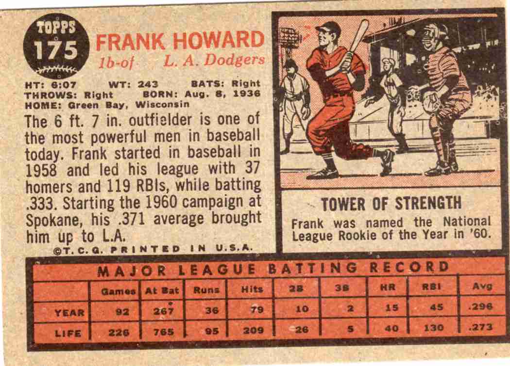
Up next: 1960-1964. Bold, boring, and blinding.

Monday, April 13, 2009

Topps Card Numbers - 1951-1954

I will be going on a bit of a vintage kick in the next couple of weeks and I'm going to start it off with something slightly bizarre. A review of the card numbering from every single Topps base set. This is what the internet is for folks, overly detailed accounts of obscure minutia of interest to maybe two or three people. I'll make those people happy, and that's what counts. I've had a mild obsession with poorly designed card numbers for a whole now, but this post by Night Owl spurred me to take action. One of the big flaws in the 2009 Topps set is the tiny, unreadable card numbers. Instead of writing a tirade about the lousy number design (black numbers on dark blue??) I'm just going to show off all the number designs from Topps to show you all how it used to be done and let you judge for yourselves. Let's begin at the beginning, shall we?

1951 Topps


This is the only Topps set to have the card number on the front, rather than the back. Of course it was an oddball card game, so it wouldn't work too well to have the number on the back as you'd be playing with a marked deck.

Considering the unorthodox layout for today's standards, The number is fairly easy to read and has the added bonus including the total number of cards in the set, helpful information for the 1951 era set completer. The placing is a bit awkward though, numbering the bottom right of the card isn't terribly optimal when you're sorting through cards. There's only fifty-two in the set and the cards are smaller than normal so it's not that bad. Considering they didn't release their first 'real' set until a year later, Topps did ok on this one.

1952 Topps

Everyone should be well familiar with this number, Topps has only used the design about two dozen times in the past decade. Topps began a remarkably consistent run of excallent numbering design in the fifties with their inaugural set. The number is put right in the middle of a baseball. Simple, good looking and best of all very readable. The black number on the white ball inside a red background has great contrast and you don't need to squint to know what card this is. It looks best on the cards with white card stock, but is still readable on the other variations.

The number still pops out on the all-black backed cards as you can see. Best of all, it is located in the top left corner of the card. This is my favorite place for the number as it's easy to see when you are sorting through a large pile of cards. Hold the cards in both hands, slide the top card a bit with your right thumb, and there's your number. This works great for right handed people, do lefties find it easier to sort when the number is on the right side? I would guess so, but I'm not sure there's an orthodox method for shuffling through cards. I know one thing though - I hate when the number is on the bottom of the card or in the middle. It screws my shuffling all up.

Here's an example of the number on a card with the gray stock. As you can see it doesn't pop out quite as much as on the white stock but it's still very readable.

1953 Topps


This is in my opinion the greatest card number of all time. The number is huge. The baseball it resides in is almost an inch in size. Legally blind people can make out these numbers if they squint a bit. I also love the rad font they used for TOPPS.

Again, the number is on the top left corner of the card. Unlike this year's set, Topps usually put the number in this spot. I think the number is one of the reasons why I love the '53 set so much. I have a history of abysmal eyesight in my family, and once I become blind as a bat I'll still be able to enjoy the backs of these cards.

1954 Topps

Once again, we have the baseball. It's smaller than the '53 set, but still has the TOPPS logo above the number. It's not as eye-popping as the previous two sets, but the red number and green stitches have some great contrast. There's one big problem I have with this set though. On the sheets the '54s were printed on, the cards were aligned like this:

This is how they did the color bleeding off the top. This was a neat idea, but the back of the sheet looked like this:

Obviously these two cards were probably never neighbors on a sheet, but you get the point. To make it easier to print and look good if slightly miscut, the green stat portion of the card also lined up. I assume that the neighboring cards were flipped as well so there would be alternating bands of green and white on the back of the sheets. Again, a neat way to incorporate full bleed color on the cards but when you put the set together in sheets it looks like this:

I will admit right now that I have a little OCD streak in me. I kind of have to have it a bit to be so concerned with card numbers. I don't have it full blown like Jack Nicholson is As Good As It Gets or anything, but stuff like this drives me absolutely nuts. As a result, I've never likes this set as much as I probably should have. The set si gorgeous, but when you are trying to sort a few and half the cards are upside down... well, someone out there will understand. Once I'm finished with this I'm going to put up a poll of the best and worst card numbers. I'll pick the best and worst example from each post and you guys can vote on them at the end. My picks for this round:

Best - 1953 Topps
Worst - 1954 Topps

If you vehemently disagree, speak up in the comments or forever hold your peace.

Up soon - 1955-1959 Topps.