I have no idea how to create pages but I'll figure it out eventually godammit

Thursday, March 31, 2011

It's go time


The season starts right about now. Assuming it doesn't rain. Why isn't the opening series held in a southern city again? I actually got a taste of big league action a couple of days ago. Took a ton of pictures. Then lost my phone and all of said pictures. I am a schlemiel.

Oh well. Play ball!

Sunday, March 27, 2011

2011 Opening Day Roster

Assuming a trade or waiver wire pickup doesn't go down in the next couple of days, here's the opening day lineup for the Bravos:

Leadoff - LF Martin Prado


Batting 2nd - CF Nate McLouth


Batting 3rd - 3B Chipper Jones


Cleanup - C Brian McCann


Batting 5th - 2B Dan Uggla


Batting 6th - RF Jason Heyward


Batting 7th - SS Alex Gonzalez


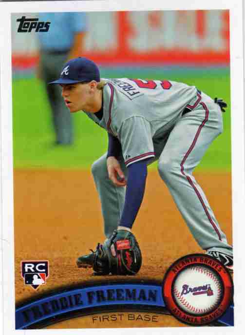
Batting 8th - 1B Freddie Freeman


Starting pitcher - Derek Lowe


Starting pitcher - Tommy Hanson


Starting pitcher - Tim Hudson


Starting pitcher - Jair Jurrjens


Starting pitcher - Brandon Beachy


Bench - C - David Ross


Bench - IF/OF - Eric Hinske


Bench - PH - Brooks Conrad


Bench - IF - Brandon Hicks


Bench - OF - Matt Young


Bullpen - RH Closer - Craig Kimbrel


Bullpen - LH Closer - Johnny Venters


Bullpen - RH- Peter Moylan


Bullpen - LH - Eric O'Flaherty


Bullpen - RH - Scott Linebrink


Bullpen - LH - George Sherrill


Bullpen - RH - Cristhian Martinez


All righty then, let's play ball.

Thursday, March 24, 2011

I am a terrible person

I just realized this and I learned about it from here. Didn't even figure it out by myself.


I have brought shame upon my family.

Wednesday, March 23, 2011

The little details make all the difference

One of the weird quirks about the 1962 Topps set is the card numbering. Check out this number on the '62 Minnie Minoso card.


A simple white number inside a small black baseball. Pretty basic stuff. Not too hard to read and it's in the upper left corner so it's easy to sort. (At least for me it is, do lefties prefer the number on the right side?)

2011 Heritage is copying the 1962 design so it's important for them to get all the details right. Like the card number. Here's MVP Hambone's card:


Nailed it. If anything the number is even more clear and easy to read than the original. Clear is good when it comes to card numbers, especially when many of the collectors are old geezers with bad eyes like me.

But wait! In 1962 Topps switched things up somewhere around series two and used a different design for the card number:


Well lookie there. Larger baseball, larger number and the number is in bold for easy reading! They even replaced the top row of stitching with the original Topps logo. Nice choice by the '62 design team. But wait! Did Topps muck up the details in a retro set yet again?


No, they didn't! Huddy's got the good number on the back of the card. The designers were paying attention this time. The entire back is pretty spot on actually. The stats are right (No WHIP or OPS here), there's a significant chunk of biography text on the back and the cartoons are in the original style. I haven't figured out if Topps recycled the toons from the original cards or not. I haven't seen any I recognized from my small stash of '62s yet. The only real differences in the two are the much increased trademark and legalese usage on the modern card.

Ah, but I was focusing on the card number for this particular post. The '62 crew were tinkerers to a fault and came out with this slightly different number for series 3:


For some unknown reason, the nice bold font on the card number was reduced to a skinny squinty shell of its former self. Ok, so the numbers are actually the same size as the first series numbers. It just looks smaller due to being in a bigger baseball. Thankfully Topps decided it was more important to save our eyeballs from the squinty numbers than to be completely historically accurate and there are no squinty numbers in 2011 Topps Heritage. Whoever decided that made the right call. It's not healthy to be too obsessed with the minute details in these retro sets. Although the Topps logo on the card number is clearly the wrong font. And the card backs are flipped when you compare them to the originals! What the hell Topps!?

Thursday, March 17, 2011

Something Green For St. Patty's Day


No, I am not buying a box this year. I'll pick up some packs and a few blasters. No Hobby box.

Why?

At my main card shop today I saw two things of interest:

A 2011 Hobby Box of Heritage: $90.
A 1955 Bowman card of Hank Aaron: $62.50.

Yep. Not buying a Hobby box this year.

I do not like this meme

Some dude (supposedly a Braves blogger) just called Jason Heyward "Jason Heywood" SIX times in an article on the Braves over at The Hardball Times. There's absolutely no way I can take this article seriously after that, not even with its fancy PITCH/fx graphs. Here's a screenshot for if/when someone bothers to correct it.


This has ruined my whole morning...

UPDATE: They fixed the Heyward section but left the sixth Heywood intact.


lol