Topps is catching a lot of crap about their quality control lately. People are whining and kvetching about miscut cards, curled up Chrome, boogered redemptions and Honus' polyester jump suit. There are mumblings and grumblings about Topps' lax attitude after receiving a monopoly on officially licensed baseball cards. Talk that the lack of competition has made them lazy and inattentive towards the needs of the customer. Even worse - the perception that they don't care about the hobby at all and are just out to make a quick buck is taking hold. I'm here to tell you that this is all wrong. Topps hasn't all of a sudden lost interest in producing a quality product. They're just bloody incompetent! Poor quality control has been a hallmark of Topps for decades! It's practically their heritage! Submitted for your approval is a pair of cards from days gone by.
Here's a card from the 1958 Topps set.
Ain't that gorgeous? Good 'ol Jackie "MVP" Jensen. Might have been an all-timer if he didn't hate to fly. We'll call this card Jackie #1. Observe the bold colors and crisp photo and oh-so-nice centering. Now here comes another one...
Here's Jackie #2. Observe closely, but not too closely lest you hurt your eyes. Note the red stripe below the Sock Monster logo. The white outlines around Jackie's earlobes. The overall fuzziness of the whole shebang. That there is poor photo register. Downright mis-registered if you ask me. This occurs when one of the color plates prints just slightly off from where it's supposed to print during the printing process. This is pretty a pretty common occurrence in items designed to be printed quickly and cheaply. You see it all over vintage baseball cards sometimes to spectacular extents.
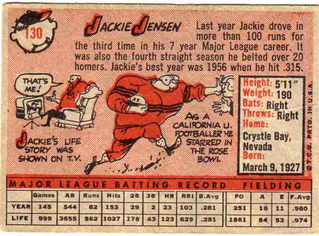
Ok, so one card is printed correctly, the other not so much. Now let's look at the backs.
This back is printed perfectly. Well, a little off center, but let's not be picky. The red is where it's supposed to be and so is the black. Good printing job all around. Now here's the other back.
Hey! this one's centered! The red's all over the place though. Jackie watching TV has a huge red beard. Jackie the football player has a river of blood pouring out of his neck and off his shoulders. Everything else has a 'colored outside the lines' vibe to it. Well, obviously the poor printing job is on the card with the off register front, right?
Nope. The good front has the bad back and vice versa. Remember, the off-center card had the jacked-up front. So weird quality control had been happening since forever at Topps. To be fair, I just happened to have doubles of this particular card and by blind luck they both had register problems. Less than 5% of the '58s in my collection have crummy register and I loves crummy cards. They're still there though and pretty common, just not with the ubiquitousness of curly Chrome. So don't be thinking Topps' quality control recently took a nosedive, they've had issues forever.
So there's your answer. Topps cares about cards, they just aren't really good at printing them quite right. Chillax! They're just cards, people! It's not like they cost $100 a pack or anything! That would just be absurd! Now, why the shade of blue on both cards is completely different, I have no freaking idea. You'll have to ask Topps about that one.


4 comments:
A classic case of what could have been. He was a hell of a ball player and I believe Jackie retired twice because of his fear of flying.
OK, I was right with you all the way until you said "chillax."
(*shudder*)
I must de-Miley my computer.
I knew it! Not a recent thing at all. Thanks for bringing this lackadaisical attitude to my attention. I'd blame it on the Toppsopoly, but I'm sure they had plenty of issues in the years when they weren't the only licensed producer of collectible cardboard.
The thing that most caught my eye in this post is that you have 2 of these. And it just so happens there is already a package in the mailbox headed your way...
Post a Comment