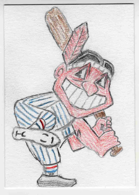
I have at least five sketch cards I need to draw, so obviously I'm going to post on the blog instead of drawing. I know! I'll post... a drawing! That will simultaneously procrastinate and make me feel bad about procrastinating! Here's a sketch card sent to Baseball Dad over at All Tribe Baseball.
TribeDad has a bunch of trade packages cluttering up his desk too! We're like soul brothas. I sent this one over along with some Topps stickers and a bunch of Indians I needed out of my house. I needed a break from drawing actual people after my sketch card of Billy Madison so I went with the classic Indians logo Chief Wahoo. Yes, I know. The logo is horrible and terrible and should be banned forever. The first person who invents a time machine should forget about Hitler and go back and murder Louis Soxalexis as a child so we can have something wholesome as a logo instead. Like Spiders. Or Napoleon. It's a bad logo and I should feel bad for drawing it. Fine. I'm not arguing with people who think like this anymore. If your method for improving the world is shaming sports fans whose favorite team picked the wrong mascot a hundred years ago then more power to ya. I hope you're also donating to a charity that helps Native Americans in need as well. And putting in the legwork to find one that's not a scam. I'll take the shame, hell, I'm a Braves fan, I double deserve it.
I copied the design off of the sign that originally perched on Municipal Stadium. If nothing else it's a neat pose with that high leg kick. One thing that strikes you when you sit down and actually draw the Chief Wahoo logo is just how utterly ludicrous that face is. I've seen that thing for decades and knew in my heart that it was kinda freaky at best and horribly offensive at worst, but when you're forced to sit down and examine it the weirdness envelops you. I'm not saying I don't like it anymore, I'm just saying it's downright bizarre. I don't understand the pointy eyebrows. And that is a big dang mouth.Steven Tyler would have to get the "Why so serious" treatment to get a mouth like that in real life. The face actually reminds me a bit of Robert Crumb's The Snoid, which is WAY more offensive than the Chief could ever hope to be. As far as drawing the thing goes, there was more learning how to use colored pencils, The foreshortening on the leg was neat to do and I discovered pinstripes are fun.
Here's the back. I'm basically referencing the fact that Cleveland beat Boston in 1948, and Atlanta got revenge in 1995. We should have done the tiebreaker series in 1997 seven but Eric Gregg accidentally the strike zone. This is another example of "I don't like lettering, I'm not good at it and I refuse to put any time into it". Baseball Dad sent some other stuff back my way including some stickahs you will hopefully get to eyeball tomorrow. Thanks Dad-dad-daddy-o!


6 comments:
This came out well. Nice job!
SCB Tip of the Day:
When doing letters, write the letters normally and then outline around the letter for good looking lettering!
This has been your SCB Tip of the Day.
This probably makes me a bad person but I've always loved the Indians Logo, and your sketch of Chief Wahoo is awesome, nice job. As for the lettering, practice makes perfect. I'd almost rather have artistic sketch talents like your than better lettering like mine (if my job had not depended on my drafting/lettering skills in the beginning)
My wife is from Ohio and I bought her a Indians hat with the Chief Wahoo logo. She never wore it, so I started to.
Word of advice: when you live in Oklahoma (terminus of the Trail of Tears,) DO NOT wear a Indians hat with Chief Wahoo on it. The looks you will get.......hoo boy.
SCB: But... my handwriting is also atrocious... My biggest deal is I don't put any time into it. I can make lettering look almost decent if I put some effort into it. I tried your trick though and it does kinda work even with my handwriting. Thanks for the tip!
dawgbones: I like the Indians logo too. It's a fun logo, like the Orioles bird. It's just dicey on the taste scale nowadays. Of course the same can be said for popular culture in general.
carlsonjok: LOL. I'm actually part Cherokee, so I'll give you some looks through my laptop screen too 0_o >:C @_9
It is awesome ! And yes, I have a whole box full of trade packages to get posted.
The Topps anniversary team set I just broke up really put me behind ! I will get them done though ! Thanks !!!!
Post a Comment